334: The DEVIL is in the DETAIL

I have grown to respect a number of designers of all nationalities and Fernando Gilgado from Spain is one who is guaranteed to produce a challenging model:

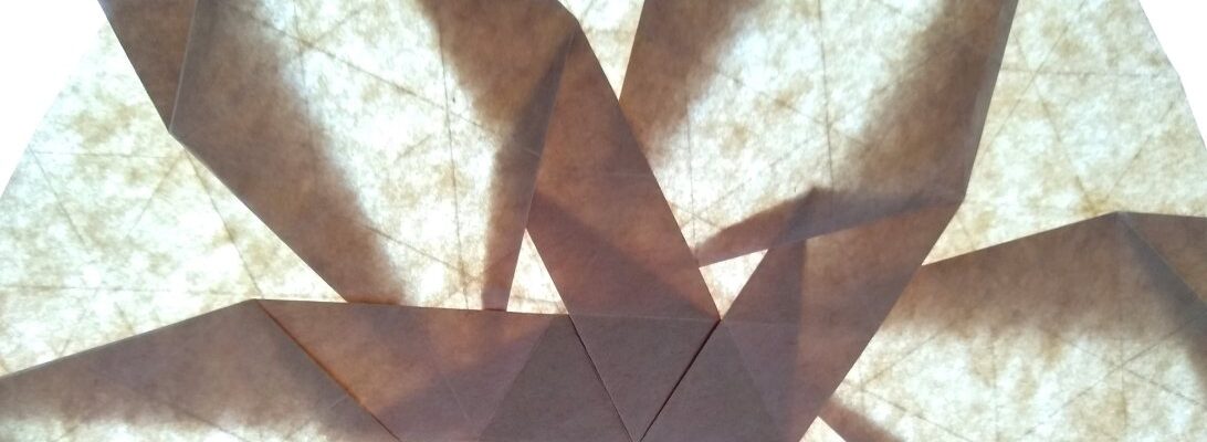
This is the Demon, and the devil in the details, trust me – his head alone is frightening – 2 sets of horns, beard, snarly mouth, eyes etc. His body is very dense, arms and legs 20+ layers of paper but that bunching results in the most splendid wings and a pointy demonic tail.

This instruction set was a real challenge – apart from folding it during school time (in between end of year report checking and tidying up), the instructions were in Spanish, and some aspects of it were very fiddly indeed. Even at 54cm x 54 cm, the head and facial features were too small to fold tidily, still, as a first fold I am very pleased with this. It is a monster, wing span of nearly 30cm and he looks very menacing – in a cutey sort of way.

I thought the “angels” of yesterday needed some “demons” today to bring some sort of balance to the paper cosmos. A suitable end of my second last month of this challenge.

245: You Shall NOT Pass!!

Now I am an out and proud “Lord of the Rings” fan – loved the books, liked the movies – the standoff betwixt Gandalf the Grey and the Balrog was such an amazing bit of cinema:

This here is a (sort of) Balrog – pity the photos do not do it justice. Nice leathery wings, a grimace on his face and sort of snarly hands and a lovely tail.

I am writing exams at the moment and the phrase “you shall not pass” is something I try to keep furthest from my mind whilst doing it – I am sure my students would hope that is the case also.

Some interesting teasing of a blintzed preliminary base that is crimped and petal folded in interesting ways – the base that results I can see huge potential in as it has 8 symmetrical flaps asking to be bent into something else – must have a play with it. I found the instructions for this critter on the interwebs and have NO idea whose model it is – anyone help me out? … anyone out there?

211: Cello

If I were asked to pick a stringed instrument that I love the sound of, it would have to be a Cello:

The tones and resonance from it’s timber soundbox are lovely, soulful and evocative if played well

I have had this design for a while, and thought it wise to try it out on a larger format paper (as the creasing to suggest shape, wooden workings etc are quite difficult to place) and am happy with this as a first fold.

The trick is to try to keep the front face as crease-less as possible so the shape creases stand out, fairly happy with how this turned out, hope you like it too, (if there is anyone actually keeping up and reading this junk that is)

206: Celtic Cross

This week is Catholic Education Week – now I am not a Catholic, nor ever religious but I know that at my place of work there are a number of important ecumenical symbols – one of which is a Celtic Cross:

This model takes a preliminary base and distorts it in interesting ways – designed by Tadashi Mori it is an interesting geometric form that has its roots in ancient UK cultures.

Our school has one in it’s quadrangle, and our school crest has one as well – appropriate symbology I thought.

161: A Dragon

Now I have been looking for nicely shaped Dragons:

and stumbled across a Hungarian fold that reminded me of a cartoon one.

Lovely wings, thick and powerful tail, nice head – a fairly simple fold actually but sometimes simplicity is good too.  

I am working towards a Satoshi dragon, so I need all the dragon-practice I can get. I would like to pretend this one was my first-fold, but I scored a Year 11 Maths C stuporvision at school, and got bored with matrices and vectors so tried it then – so sue me.

Was going to give it to Josh, who has not shut up about dragons since he heard I was going to try the ancient dragon, but then he did not stop talking so took it back – you win some  lose some I guess.