Just trying to get my head and mouth around the name of this geometric modular provided the imperative to fold it:
Designed by Daniel Kwan, it is based around Francis Ow’s 60 degree unit, folded on a 4:1 rectangle that then has 30 degree crimps placed at thirds down the length of the paper, on opposite ends. The resulting units seem to spiral.
Units are joined in groups of 4, making a single solid descriptively called a “Gyroelongated square dipyramid” – “gyroelongated” meaning it is an extruded and twisted solid, “Dipyramid” because there is a regular square-based pyramid at each end of the solid.
Daniel illustrated they could be interwoven – 3 can be symmetrically interwined to make a visually startling whole.
The hardest part of this model was working out the symmetry of the intertwining. Merely seeing a finished one was not enough, you need to discover the scheme that, symmetrically, distributes spokes of each sold over and under, taking into account the twist, yet still meet at a pyramidal end WITHOUT overly distorting the units.
There are many legendary folders out there and, thanks to the Interwebs, it is possible to connect with many of them via socials (and rare cases in the real world – wherever that is):
I am obsessed with the intricate sculptural pleat work of Goran Konjevod (@foldsome), and love playing in the space of densely pleated paper.
This piece, inspired by a piece from Goran, started as a 12:1 rectangle. With regular mountain divisions (1/2, 1/4…) until the creases were just over 1cm apart. I then successfully guestimated a tight and completely circular SPIRAL by pleating each mountain on the same angle, creating a lovely rosette.
Next, using a padded surface, on the reverse I scribed an irregular spiral track from centre out to edge.
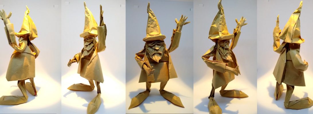
I have a “2 fold” pile that stretches back years. One fold, from the book “VOG 2” finally bubbled to the top:
This is the wonderful Tortoise designed by Nguyen Hung Cuong, a fully 3D model that, although it has a simplified structure, has all the hallmarks of a Testudine (the family of Tortoises – generally slow-moving land-dwelling relations to turtles).
After test-folding the major structure of the model, I dug out a 50cm square of Satogami, from Origami-shop and began folding. The sequence is lovely, and rewards the folder for taking time and contemplating the angles of the many “to about here” folds inherent in the shaping phases.
Someone more talented than me could probably add more details to the head and shell, but i like the suggestion of detail and attention to proportion of this model. I wet-folded sections of it and, because it has such good locks, it is pretty stable by dry-folding alone.
I have been playing with approximations of non-euclidean based geometric representations of “squares” – those shapes that have 90 degree corners. In curved space that geometry gets seriously weird, really quickly.
I operated on some standard Kami to create shapes that had 90 degree corners, but to my surprise, I managed a 2,3,5,6 and 8-sided “square”, depending on the size of the “plug” I grafted into the square.
I could then form “square bases” with these sheets – the preliminary fold is the base for many designs. Interestingly, the number of points a sheet has when put into a preliminary base is governed by the number of sides the sheet has.
Working on the 8-sided square, I then went about folding a traditional crane (Tsuru), and noticed I ended up with a surplus of appendages. With some re-arrangement I was able to return some of the classic vibe to the rear of the crane, but that resulted in 5 heads.
I have seen similar (like up to 3 I think) multi-headed cranes designed from conventional 4-sided squares, but the model efficiency is usually terrible because the point-splitting methods necessarily reduce the size of the final model exponentially.
We are all very familiar with planar geometry – we see, for instance, a square or rectangle is a plain shape with all 4 corners being right angles (90 degrees). Curved space gets a LOT weirder:
It is possible, for instance, to construct a shape on a curved surface that has 5 (or even 6) corners, each having a right angle. Origami typically deals with sheets that start flat – a non-flat sheet affords fascinating properties.
After a conversation with Goran Konjevod (@foldsome), I wanted to try a technique he pioneered involving radially pleating such a non-Euclidean square.
Ages ago, using up the white papers from a cheapo pack of coloured 15cm square origami papers, I first had a go at folding an origami “Spirit House”:
Designed by Ichiro Kinoshita, this model emerged from my “to fold” pile and it was meant to be.
I had not long returned from a trip to Japan (in the late nineties), and fell in love with the idea of having a Spirit House at our front door. Apparently it is a tradition to provide a home for good spirits – they then repel bad spirits. We have had our “spirit house” for decades, I love it.
I decided it was time to fold a better version of the rough first go, so turned to my stash of hand-made Kozo and cotton paper I had made from pulp back in October 2024 – it has a “stone-like” appearance so I thought it would be perfect.
I cut 3 18x18cm squares and a 20cm square, then set about folding the parts (it is sort of a modular, 2 parts of which need to be glued together). The paper is fairly thick and fabric-like, but takes folds fairly well. I used some strategic glue spots to keep seams closed, wrestled a little with the thickness but was happy with the results in the end.
As often happens, I was approached by a mate to fold a model for him (MJ) – he wanted a “Chook” for a surprise gift for his wife (Nikki) on her birthday. I love a challenge, so began looking for the best origami chook.
Turns out there are LOTS of roosters out there, but relatively few hens that looks like hens – I wanted feathers, volume and a playful but realistic chookiness and found in Makoto Yamaguchi’s beautiful book “Transcendent Origami”, a chicken designed by Kyohei Katsuta that I knew I needed to fold because it was perfect.
After doing a test fold, it became apparent that it was a 2-part model (top half has the rings and tail, comb and wattle) and the bottom half has the legs, beak and fluffy bum. It is a colour change model so with some careful “Kimiroing” I was able to use 2 sheets of glorious black spattered Shadow Thai (from origami-shop.com) that has Rorschach-like inkblots on one side, black mulberry on the back. The black was perfect for feet and beak. I laminated some red Kozo in the spot that would become the comb and wattle and I was away.
From my test fold, I was able to guestimate the paper size to make the chook more or less life-size – well, more of a bantam, but large enough for my purposes.
Few modern origamists are as prolific and inventive as Jeremy Shafer – he seems to be creating new models constantly, and most importantly, his designs are fun to fold:
This is his Pyramid Tessellation field – each molecule has pre-creases that have easy landmarks, meaning you could expand this field in any direction as far as you have patience for.
This version is a 4×4 field of 16 separate square-based pyramids – a lovely thing in itself but when you start playing with it it starts to do wonderfully weird things.
Using just the existing creases, the model flexes diagonally and also horizontally/vertically. When you flex it diagonally it turns in on itself and COLLAPSES down to a hexagonal stack – this initially broke my brain until I noticed the pre-creasing actually formed pyramidal faces that are equilateral triangles – the collapse then is just one state it can be arranged into.
At a recent Papermakers and Artists of Queensland (PAQ) weekend workshop I had the time to explore some early techniques that made “paper-like” ancestors of the modern thing we know of as paper.
I had carefully scraped, cooked and cleaned some Paper Mulberry bast, but left it in bark sheet form, and was interested in treating it differently. Conventionally I would cut it up a little and then beat it until it became uniformly pulpy, suspend that pulp in water and catch thin sheets of it on my mould and deckle.
…but …
In Meso-America (ancient Mexico), they would take similarly cooked inner bark from a fig tree (sadly I think the species they used is now extinct), WEAVE the strips together and then beat it until the strips spread and combine and their fibers inter-connected, making a “pre-paper” surface called AMATE.
I tried this with my mulberry bast – beating the woven mat with my “Andy Mallet” until it spread thinly across the flat-spun organza I lined my wooden beating board with. This was then gently couched between 2 sheets of fine cotton, and joined my paper post in the press to get rid of the excess water.
The result is lovely – with practice I think I could get it thinner and more even, but as an experiment it resulted in a lovely “paper-like” substance that is very strong.
The second such experiment had me lay layers of bark down, changing the direction of the layers each time – when beaten, the resultant sheet spread more, was thinner and a little more flexible when dry – this technique was meant to simulate aspects of the PAPYRUSprocess – originally made in areas like Egypt from the pith of water reeds, laid in layers that alternated direction and then beaten thin until the fibers meshed.
There are historical examples of both types of pre-paper that are thousands of years old – a fabulous record of written history. In the west, things like Vellum (stretched and dried animal skins) pre-dated what we now recognise as paper, but the pre-papers are interesting in their own right.
I think the “papyrus” process resulted in the most interesting looking sheet – I think it looks a lot “seascapey”, but both are interesting. Mulberry bast, before it is beaten has an interesting texture – just under the 2 outer layers of bark the bas has a “grain” which is lost when the bast is then beaten and fluffed into pulp. I like that these techniques actually accentuated the grain, showing off the silken waves in a beautiful and lasting way.
30 unit modulars exist in many forms, permutations and complications, few rival “Russian Lilac” for sheer time-consuming brutality:
Designed by Andrey Ermakov, this astonishing spikey ball has been quite a journey. I first added it to my “to fold” pile for a few years now, and then narrowly missed folding it as part of the IOIO (Internet Origami Olympiad) in 2021 – it was the nightmare round 2 task (I was knocked out in round 1).
The FIRST hurdle for folding this is the need to create 30 perfect regular hexagons that are all the same size (I created a few extra just in case shit went sideways). To do this, I cleaved a 2.1:1 rectangle from a 70cm wide roll of white/natural Kraft paper. Using 47 construction lines to form a regular TRIANGLE GRID on this page, I was then able to isolate 35 adjacent hexagons, which I then cut out carefully (scissors warning!!!).
Each hexagon then receives a 16 grid in all 3 axes, then 4 extra pre-creases before you begin unit folding. This totaled 1470 pre-creasing. Having bailed near the end of this year’s “Advent of Tessellations”, determined to return to it after some distance, I am not sure why i then bounced to another triangle grid on hexagon marathon project – I am guessing the time with my counsellor will eventually surface the reasons for the self-inflicted PTSD 😛
To form each unit, each hexagon then goes through 79 processes – all up each unit took me just over an hour each.
The main premise behind “2d colour-change origami” models (of which the flattened unit is one) is that you strategically utilise the edges of the sheet so you can reveal both sides of the paper along it by some clever flanges and flipping. The GENIUS of this model is that we use colour change to (when assembled) establish a colour-change triangle checkerboard across ALL outer faces of the finished polygon. Sadly each little triangle is not SEAMLESS – most are but not all, but based on my experience folding Daniel Brown’s seamless chessboards, I know this provision makes the design infinitely harder.
When I bought the book “Potential Origami Collection”, there were a few models in it I slated as “yeah, you are not good enough to fold that, yet” – this model was one of those:
This is Jeong Jae Il’s glorious horse, and it may be my new favourite origami horse (bumping Dave Brill’s triangle-based horse off the top spot – sorry Dave)
The exacting and unforgiving early pre-creasing is difficult (I did not photograph it because I was so lost in what I was doing) – and challenging to be accurate as it involves a LOT of constructing angles on long diagonals – with my chosen 90cm square those diagonals were really long (leading to a little inaccuracy). A 90cm sheet led to a finished model that stands, rearing, just over 30cm high.
The actual collapse and folding is different to most diagrams – once the BASE of the model is arrived at – a roughly horsey shape with flaps for heat, tail and 4 legs articulated more or less where they need to be in the final model, the designer then COMPLETELY develops each feature before moving on to the next. Head, front leg, the other front leg, tail, back leg, other back leg.
Other designers scatter finishing details (do a little here, move somewhere else and do a little, return here eventually to do a little more etc.). Some models have inter-area dependencies I know, but it was refreshing to see each bit refine in my hands – very satisfying folding indeed.
I will fold this again, and use nicer paper, but, in my opinion a GOOD model looks good with plain paper – this one does – it is just so “horsey”.
I really enjoyed folding this model, just got lost in the process. I decided not to wire it to a base internally as it would disrupt the lines too much, so stabilised the open seams and then added a central clippy-stand thing that grips the internals up near the neck, allowing the model to balance in the rearing pose pretty naturally.
A model that has been on my “must fold” list for ages is the best origami Giraffe there is, designed by Bodo Haag:
After test-folding this model with a 90cm sheet, I decided to get closer to the recommended 50cm square by using a 70cm square of duo Kraft paper (part of my last roll of Ikea black/natural stash).
Some designers combine brilliant design with delightful fold sequence and this model has both. It is challenging, but entirely followable – some amazing moves strategically position the edge of the sheet towards the centre of the pleat bundle that will become the neck, body and legs – this affords an intricate set of edge-crinkle colour changed for the spots – just so clever.
The paper was a little thick, but I persisted and managed to complete the shaping pretty well. The long spindly legs needed help, so I added wires to allow it to stand on a base, I posed the legs so there was a slightly irregular stance.
This is my presentation fold of 1ctzH8jmON2’s Delicious “Bone Dragon”.
The CP and photodiagram guide for shaping appears in Orifancy6 (my late Halloweeny post).
Folded from a 65cm square of grey Unryushi with black, grey and white accent fibers.
grok.com made this AI animation of the fold – not quite sure how I feel about it but there you go:
I love this model – to mee if feeeels like a proper dragon. It has a wire armature, allowing it to free-stand and it can also be posed. 65cm is quite small (for me) for this model, due to layer build up, but from it’s many horned head thru its lovely rib cage to the tip of it’s tail it was lot of fun to figure out.
One of the many models I have had on my “to fold” pile for ages is Chen Xiao’s “Walking in the Rain”:
This box-pleated model seems to have taken me an age to complete for many reasons (including what I consider a weakness of box pleating), but finally I committed a square of pre-prepared Wenzhou paper to a rendering of this design.
The paper was previously Eco Dyed: Sandwiched between each layer of the folded up sheet was various vegetative matter – onion skins, tea leaves and other tannin-based plants. This bundle was boiled for a few hours in a “dirty pot” containing red cabbage and purple carrots. The cooled bundle was then carefully washed to remove all the bits of vegetation leaving subtle stains. This paper I called “Cherry Blossom” Wenzhou because the dappled pinks and muted browns reminded me of blossom trees.
Like many paper folders, I have a list of models awaiting folding, and this one has been on it for years:
This is Kyohei Katsuta’s delicious design of a “Blakiston’s Fish Owl”, an endangered species and one of the largest owls around.
I took a 90cm square of Kraft paper and, using my usual mantra of “fold until it is finished or it fails” I set off. After a 12 grid, with partial 24th is set, a few strategic diagonals, you then embark on a really fun collapse sequence to arrive at the base.
This model is a study in strategic deployment of layers – the feathers, body volume, features – all of it comes form considered deployment of the accrued layers from the collapse. It is nothing short of a masterpiece.
I am happy with my fold – I will probably return to refold it at some time with nicer paper but it stands an important test for me – a “good” model in my opinion looks good rendered in plain paper. I could have spread the chest feathers a bit more I guess (although I tried and did not really see a way to achieve this), but the overall morphology if the model is pleasing.