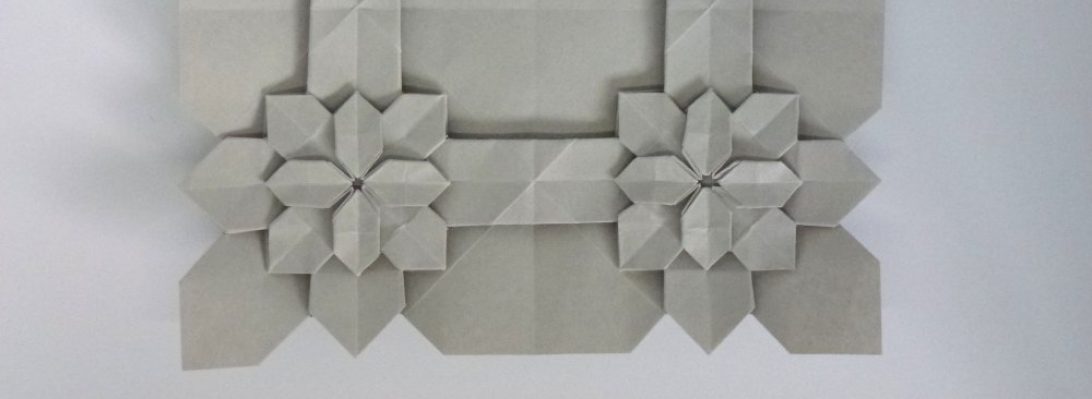
1140: Acorn Box

Browsing through the latest JOAS Tanteidan Magazine, as one does, I came across a seemingly simple but delicious little pentagon box in the shape of an acorn designed by Tomoya Kariya:

Exploring the sequence, I figured I could shepherd some of my hand-made paper through it, and reasoned that banana paper would make a beautiful cap, lemongrass and cotton paper would contrast nicely for the kernel.

I turned to my stash and discovered I had some smaller offcuts, so set about making matching 6″ squares of the rough but beautiful paper.

Folding hand-made botanical fiber paper is really hard on the finger tips – the lemongrass paper is actively spikey, but, being strategic and deliberate when manipulating tough fibers that lay on creases, I was able to coax the paper to take shape.

I LOVE the result – the handmade paper is PERFECT for this fold, it enhances the organic shape and makes it feel like a precious relic.

Continue reading

1134: AMOS

1: Knock knock.
2: Who's there?
1: Amos
2: Amos who?
1: A Mosquito. <insert hysterical laughter of a little kid (me) amused by the first dad joke he can remember his dad telling him> True story.

I have bought many sheets of the most amazing paper, all dutifully stored in my “cave”. Over 10 years ago, I purchased a full sheet of black Unryushi single tissue because I HAD to have it, but having NO plan to use it.

Unryushi tissue is beautiful, painfully thin (24GSM) but gloriously adorned with visible mulberry fibres. It comes being about the stiffness of facial tissue – I misted a large window with water, rolled the sheet onto the wet glass (shiny side down) and then added a coat of MC (Methyl Cellulose) to the back side, removing air bubbles from the centre out.

Even wet, the Unryu is really strong, but to make it foldable I needed to crisp it up. I managed to cut a 60cm square, leaving a >12inch selvage for another project.

The latest Tanteidan magazine had a enthralling Mosquito design by Yoshio Tsuda and I knew I NEEDED to try it, but lots of the model is 12+ layers thick, I knew I needed some crazy thin paper … hence the Unryu. I decided to fold Version 1 of the Mozzie, knowing that Yoshio also published a crease pattern for his revised design – that will do for another day.

Continue reading

1133: Pelican

Perusing origami books, as you do, I chanced upon a delightful little pelican:

Designed by @tommy03, making use of a beige/white duo 6″ kami square, this delightful model captures the essence of a pelican better than any other I have seen.

“What a wonderful bird is a Pelican – whose beak can hold more than it’s belly can.” – A rhyme my mum used to say to me as a little tacker – hoping to gift this to another mother tomorrow.

Sometimes simple is stunning too.

Cat, Rat, Cheese

I had forgotten how wonderful it was to lose yourself in a fold, particularly an Eric Joisel design:

I decided it was time to re-fold Joisel’s Cat because … the last time I attempted it back in 2011 (as part of the original 365 project) she turned out barely recognisable:

Naturally, the cat is looking at something, I decided it must be a rat. There are few more character-ful designs than Joisel’s Rat, so I folded him again – this time on a sheet 1/4 the size of the cat (to sort of get the scale right).

I reasoned the rat was around for a reason, so quickly found Jeremy Shafer’s “Cheese” design and decided the rat’s next meal would be cheese (unless he himself did not become dinner for the prowling cat). I folded the cheese with a square 1/4 the size of the rat to sort of get the scale right.

All too often a fold is completed in isolation – few designers design “sets” of models that are sort of meant to go together. Joisel’s Cat and Rat reference each other in their diagrammed sequences – I like that. Both models have challenging sequences – each with places where your judgment on where a fold goes completely changes the attitude of the model – I like that also as it let’s you infuse character into the model, and often means subsequent folds look different.

I think the only other origami artist that comes to mind for designing “scenes” is David Brill – his masterpiece “Brilliant Origami” is full of fun tableaus.

1127: Bin Chicken

The majestic “Bin Chicken” is, sadly, an aussie icon – those black-headed ibis emerge from the deepest, moistest corners of a ripe dumpster, dripping bin juice.

Yes, I KNOW that an Egret is not an IBIS (the beak is different and the body colouration is different… but… creative license). This is Jeong Jae Il’s “Egret” – a beautifully lifelike rendition of an altogether more polite bird. The diagrams, from “Potential Origami” suggest heavier paper, so I trotted out a lovely 58cm square of duo Yukogami to work this model.

The paper is stark white one side, jet black the other, heavily textured and light cardboard in thicknicty, but I thought I would fold until either it was finished or it failed. The only real struggle was thinning down the legs that end up being about 12-18 layers. In finishing, after dry-shaping, I slid a little white glue inbetween the layers then re-formed on my dry shaped form, compressed and found the paper dried solid – an added bonus was I did not need to add wire, she stood on her own!!

Continue reading

Square Field Crumple

I bought some new shirts yesterday – interleaved inside was some lovely white tissue. I folded it into 3rds, then half to get a square, then half, then half and kept going until I had a small, multi-layered square about 8cm on the side.

Next I crumpled that so the centre of the square was a point. It was tough as there were so many layers. I then opened the last halving, reinforced the valley between, inverted one of the points (as one was up, the other down), and re-crumpled the points.

Repeating this technique, opening a layer, reinforcing the valleys in-between each point, inverting half so they all pointed the same way and re-crumpling, allowing the crumples to become more random as they thinned out.

Continue reading

1122: Pearl Anniversary

30 years ago, the Papermakers & Artists of Queensland (POQ) first formed – in July it was their PEARL anniversary.

As a diverse collective of artists (that allowed me to become a member) we were asked to respond to the notion of “Pearl” to assemble an exhibit of artworks to mark this occasion.

My thoughts, naturally, turned to folding and I was reminded of an organic 3D form I last explored for “The Offering” inspired by the work by legend Paul Jackson.

The idea was simple – using one set of slightly overlapping pleats in one direction, that are then corrugated in the perpendicular direction, you can “tease” dimensionality by “cheating” the overlap with a delicate pull.

Taking a square of trusty Kraft paper, I mocked up a Maquette, pleating and corrugating around a central line, then “MacGyvered” a hinge using simple box-pleating techniques, as I had the notion it should be a “book” of sorts. The hinge mechanism had a natural gutter that allowed me to bind pages securely inside also.

For the production fold, I chose metallicized pearlescent “Terryfoil”, I cut 2x 25cm squares and pleated and corrugated, carefully, then spread the pleats until it achieved the desired curvaceousness.

Continue reading

1120: Steven Casey’s “Numbat”

Occasionally I am privileged to be asked to test-fold new models, and I jumped at the chance to fold this Numbat:

As far as I can see, this is the first depiction of this native Australian insectivorous marsupial in origami and the design captures the morpohology and proportions really well.

Starting with a preliminary base, then folding a skewed birdbase, the side stripes naturally emerge in cleverly controlled colour changes, along with the legs, neck and ant-eater-like snout, along with a lovely bushy tail.

I folded this chap from a 40cm square of white/natural Kraft paper (some of my last from the Ikea stash – I wish they sold it again, great stuff) and the fold sequence was fun – some really interesting moves and a good range of skills necessary to complete the model neatly.

Continue reading

1116: Alas….Homo Papyrus

Things have been busy, lots happening in the real world so it is sometimes nice to get lost in a fold or two:

This lovely fully 3D skull, designed by Naito Yukata and wrangled from a 3:1 rectangle has been quite a journey.

The pre-creasing was fiddly but laid in landmarks that then aided the staged collapse. I found it easier to collapse parts of the model separately, then open the sheet back out to do the next section, laying in the final resting creases as I went – this meant that the “all at once collapse of the top part of the skull was easier.

The teeth introduced a lovely layered pleat structure I had not seen before and the overall shaping is a bit of an art I think.

Continue reading

1113: Shore Crab

When tidying my JOAS Tanteidan Magazines, I discovered a special edition that members used to get – one issue in particular has 2 terrifyingly complicated models I have not (to my surprise) ever tried:

This is Hideo Komatsu’s glorious “Shore Crab”, an amazing but intense design that is described in a fascinating sequence of diagrams. They are involved, number 194, and involved many advanced techniques, and in retrospect I probably looked at it at the time I got it and mentally added it to my “try later” pile.

I started with a 50cm square of crispy Kraft, and adopted my usual fold it until it either fails or finishes.

To my delight, the logical sequence and time to be accurate and careful resulted in a clean fold which I absolutely love. The resultant crab is plucky, has bulk (indeed, most of the paper is folded inside) and is just so anatomically crabby.

It takes great skill to design a model that closely resembles the silhouette of a figurative subject. It takes a special sort of genius in design to ensure that the model looks like the subject all the way around – the underside has all the features of a crab also – just brilliant.

I made a little clear acrylic stand that snugly slots into the crab’s carapace, enabling it to stand up like it is either walking or challenging and, I added some tiny spots of glue to keep seams from gaping all that was necessary to present the fold.

Continue reading

1110: Origami World Marathon 4

I have recently completed the mammoth 50hr+ live fold-along festival called The Origami World Marathon. I folded as many as I could physically attend, and it is a super rare privilege to be actually taught by such world class designers.

I managed about 14 models live, slept some and can complete those missed because, as part of the purchased ticket I gain access to video tutorials from the designers for the next year – win, win.

Continue reading

1102: The Offering

Tucked away in an inconspicuous corner of the deserted clearing, nestled almost invisibly among the leaf litter, the first signs of civilization were found in the form of a rough-hewn but definitely hominid-worked paper offering. For whom, to what, why … we shall never know:

Followers of the blog will notice occasional references to paper making pursuits. This post looks at the most recent results of a paper making workshop I attended in early July 2023. I had previously (back in 2019) been a member of PAQ (Paper makers and Artists, Queensland) but found full time work made attending events difficult. Now I am retired I have more freedom, so reapplied for membership.

The group’s interests in paper are diverse – from botanical paper making, monoprinting, encaustics, stitching, collage, pulp sculpture and more – my interests are (fairly narrowly?) folding, but it is important to have ones interests informed by a wider palette so I am very much the learner in that group.

Previous workshops I made sheets with finely beaten banana stem and cotton display board, day lily and lemongrass pulp, and still have some of the paper from that session. This session we pulped banana stem (coarsely this time) and mixed it with lemon grass, Philodendron, and South African Pigeon Grass stem, in various combinations. The pulp was added to water, then a suspension-aid made from water soaked chopped okra, which generates a mucilage that makes the vat water more goopy, helping the pulp to stay in suspension longer before settling out. The results were much coarser paper, but it presented an interesting challenge to see what I could fold from it.

I first pressed then dried my sheets, brought home still dripping. I carefully separated them from their couching sheets (old torn up bed linen) and selected sheets to process further. Using a fairly stiff batch of Methyl Cellulose, I stuck sheets to my glass and let them dry, reasoning (correctly it turns out) that the MC would make the sheets more pliable and bind the fibres more closely together (given some of them were very loosely bound, this seemed like a good plan).

Continue reading

1101: PBS Colour Change Lizard

I was asked to test fold a model from Peter Buchan-Symons’ new book in progress “Folding Fantasy 2”:

This is a colour change lizard – there seems to be a resurgence in interest in precise figurative 2-d depictions of complex shapes via colour-change at the moment. This model cleverly exposes parts of one side of the paper, hides others with the reverse side and designing such things is a real skill.

The instructions for this model are clear, paced well and really approachable. Knowing Peter’s work, the book will contain a real range of complexities (certainly FF1 was a wild ride of simple through to very tricky models – a good one for your bookshelf).

I look forward to more opportunities to test out his designs, he does things differently to other designers, and variety is a good thing when looking for an approach to solve particular design problems.

Folded from a 21cm square of Indigo print Tuttle bi-colour paper, you could go smaller but would need to be careful not to lose the thin zig-zags that are the front legs and tongue.

1100: Steven Casey’s “Clownfish”

I have the privilege of being asked, from time to time, to test fold origamists new models. Steven Casey (designer of the BEST origami echidna there is) asked me to test his new design for a clownfish, naturally I jumped at the chance:

I took a 6″ square of regular origami paper (orange on one side, white on the other) and, armed with disbelief that this was the suggested paper size, began folding.

My fold approach over the years has changed markedly – I fold until either (1) I get to the end or (2) it fails, and I learn something. I FULLY expected this to go wrong – my fat clumsy fingers do not normally fold those small squares of origami paper people keep giving me (with every good intention), and for LOTS of this model I resorted to my favourite set of bent-nose tweezers just to keep it sharp (and not mush with said fat clumsy fingers).

It became pretty apparent early on that the fold sequence was entirely achievable with 6″ (15cm) squares, resulting in a charming little totally recognizable nemo. I made a few cosmetic suggestions to the diagram set (sometimes the designer lets me edit their diagram directly) and repeated the fold on 17cm square – I liked the smaller one better but it was prolly because I rushed the second fold while paying attention to the telly instead. I would like the head/gills to lock on to the body a little more and the fins also to stay together, but these are minor unimportant quibbles.

I am hoping Steven is planning a book of his new designs, this one is lovely and reminds us all that “you just gotta keep swimming”.

1099: Songbird

To mark the release of Phạm Hoàng Tuấn’s new book, he released a photo sequence of a little songbird on Fakebook:

Hundreds of development photos lead you (sort of) through the exacting process of folding this little wren-like bird. I decided to throw some nice paper at it.

The suggested size the author used was 20cm, so I went 35cm square, thinking I would have been safe, but should have looked ahead as it got waaaay too thick due to layers really quickly. Not to be deterred, I thought I would try to shepherd the now clearly wrong paper through a torturous fold,

In the end, some features (like the head) were really clumsily folded due to thickness, but I am pretty happy with the number of bird-like features I was able to tease out of this lovely sheet. I was also reminded of an important lesson – choice of appropriate paper is REALLY important on complex-supercomplex models.

I posed and stabilised it as much as possible, and will prolly fold it again some other time. The photo sequence was super annoying to use – it kept timing out (google drives get lazy) and so many of the photos showed indeterminate actions at times I was left scratching my head thinking “what is actually being shown here”. Beggars cannot be choosers however, so I gave it a red hot crack.

Continue reading