My previous folds were with plain Kraft paper, but I decided I wanted to show off the clever colour changes implicit in the design, so re-folded them with White/Natural Kraft paper over the last week or so.
Having released only Crease Patterns (CP), part of the delicious challenge of this pair of models is working out what becomes what. Although related, the 2 models use CP variations that both allow for the formation of a box head, one attached to shoulders, the other not.
Being an active member of an online community has many benefits. Origami communities often share diagrams, and this model was shared this morning on fakebook:
This is Ryosuke Sakurei’s “Dragon Baby”, a gorgeous little flapper that is pretty clever in it’s design. I searched for published sources, but it seems the Fakebook poster must have shared diagrams from a source I cannot identify.
I used one of my old-stock thick Shadow Thai sheets – green/black duo, a 40cm square, and the design allows that quite heavy paper to be folded neatly.
It is often that thickness of paper prevents you from completing models – well designed ones make allowances, and this is an example of one that is well designed.
The subtle use of colour change, the chunky volumetric body and the proportions are just lovely. I am very happy with how this turned out. The sequence is clear, fun and relatively straightforward, but it sucked me in so completely that I did not take any progress pictures, sorry.
Digging through my stash, I found a large sheet of yellow Crumpled VOG paper. Remembering I had never done a presentation fold of Brian Chan’s “WALL-E”, I knew I had found the right model for the paper:
The original character – a (Disney) Pixar masterpiece is a lovely little character piece with one of the most expressive robots ever on film. The design is intense, eats paper like nothing else but results in features that are instantly recognisably “WALL-E”.
Squaring up the paper, I managed a 60cm square from the sheet, cleaving wisps of 3 sides and a strip off the bottom. The strip was later used to coat some armature wire to keep him in shape – the model has some lovely deep pleats that allow you to hide structural supports to give the model some longevity.
VOG paper is particularly great for super-complex models because it is really tough, takes creases well and the texture persists, even after extensive working.
I have always found ancient Egyptian symbology and art fascinating. Their attention to high graphic detail, the use of natural elements in depictions of deities, the use of gold and gemstones sublime. When I first saw the diagrams for Peter Bucan-Symons astonishing “Scarab Amulet”, I knew I needed to fold it.
From his forthcoming book “Folding Fantasy 3”, it is one of the many stand-out designs that are so terrifyingly complicated but so enticing. As part of his edit team, I also had the rare privilege of test-folding it before it has reached “the wild” as it were.
From a single 90cm square of Kraft (I keep a 90cm and a 60cm roll of Kraft in my stash all the time, they are my goto test-fold papers), via initial hex-pleat pre-creasing, we fold a many-lobed base that is then thinned, subdivided and refined to isolate, skillfully, all the necessary stickey-outey flaps in the right places.
Designing said bases is complex (at the moment beyond my feeble brain), but I like how PBS takes the time in this book to explain his methodologies, requirements and compromises for a whole bunch of the models in the book – a fantastic reference volume indeed.
Once all the flaps were isolated, the process of refining (thinning and shaping) them could begin. With so many required points, the layers really add up – managing that thickness is a real achievement. Thinner paper would help – indeed I am sure there are folders out there way more nimble fingered than me who could take it smaller, but you would need to really consider the paper choice here. Paper needs to be thin and tough (there is a LOT of sinking), it must also allow you to reverse folds cleanly (unlike a lot of laminated papers and foils that leave bunched up “kinks” when you reverse the direction of a fold).
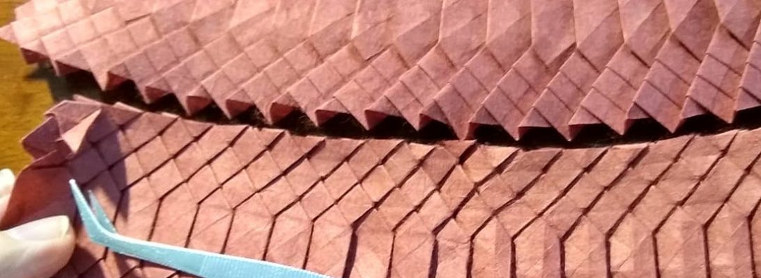
If you have been paying attention, you would know i am a member of PAQ – Papermakers and Artists of Queensland. in 2025 we are mounting an exhibition that explores contemporary interpretations of the scroll, entitled “On a Roll”. I decided that I wanted to mount a FOLDED scroll as one of my submissions, and envisaged a massive tessellation:
I needed a theme, and a style. For a theme, I decided to try and “tell” the progression of the first year of the recent Covid-19 pandemic … because I could see a sequence of “blossoming” outbreaks that progressively “break” regular society.
The style choice was more complex – I love the aesthetic of Lacquerware – the Chinese/Japanese technique of covering simple materials in coatings of red lacquer, texture and patterns. I also wanted to have hints of “Kintsugi” – the Japanese technique of fixing broken pottery using lacquer and gold.
I chose red/natural Kraft paper because the red reminded me of the lacquer aesthetic, and the natural grounds the work in a common/everyday material. I selectively also introduced gilded elements into the finished folded work – symbolising the “patching” of the broken world – I went for a really minimal touch here, arguing less is more. Read further….
Flipping through Makoto Yamaguchi’s “Origami Dragons Premium”, as one does, I stumbled across a lovely Wyvern, designed by Chuya Miyamoto:
Digging through my paper stash I found the perfect sheet for this model, a purple spotty Do paper that was part of a prize I won from Phạm Hoàng Tuấn’s Vietnamese origami paper shop pre-pandemic, so decided to give it a whirl.
My philosophy when approaching a super-complex origami design is based around “fuck around and find out” or more politely “fold until I finish or it fails”, and this model was a real treat.
A truly great design and fold sequence takes into account the material, not overly stressing it, managing accumulating layers and locking things together to keep things tidy. This design was so satisfying to fold, and in combination with the paper choice the resultant model is stunning.
One Piece aficionados know that a Den Den Mushi is a telepathetic snail used as an important communication device in-world:
Communicating via snail beings new meaning to the term “snail mail” but I remember seeing the snails in the Live-action remake and wondered if they existed as Origami.
To my delight, Tong Liu (G.T. Liu) designed one and released the diagrams in Bogota 2013’s conference booklet so I knew I needed to folded it.
I decided to try using some of my Kozo and Cotton paper that I made at Dion Channer’s Paper Mill in Gympie back in February 2024. The paper from this session was fairly soft and a little fabric-like (because, like, I really did not know what I was doing), but with a little TLC and some treatment it was perfect for this design.
There were many standouts from the epic Origami World Marathon (OWM5), the rabbit taught by Riccardo Foschi was one such:
So much character teased from a 16×16 grid, this delicious comic rabbit stands on its own and is dry-shaped, without the need for any glue or MC.
My first fold used Tant paper, and was smaller but useful to explore the structure. In this model’s case, a thicker more robust paper actually helped with the shaping – I managed a lovely plump belly and rounded face, arms and legs with toes/fingers implied by subtle divots.
As far as I can tell, NFTs (Non-Fungible Tokens) are dumb:
On this blog, NFTs stand for “Newly Folded Things”, but in the imaginary world of cryptocurrency and blockchain, NFTs were going to be the next big thing.
…until they were linked to money laundering, and people buying them realised that all they were actually buying was an entry in some blockchain register, not the “like, really cool, next level bored ape…man” [I assume that is how “the kids” now speak]
This NFT Bored ape was designed by Viswa Sarathi, and I stumbled across the design leafing through an edition of “Origamiaze – The Indian Origami Magazine Issue 02 December 2022” (yes, I was amazed there was one also)
Folded using duo Ikea Kraft paper, it was a fun (if wildly inaccurately diagrammed) fold – on re-fold I think I would refine the expression to make the ape even more bored.
Wrapping up an editing spot on a forthcoming new book, I decided to fold Tu Kaiming’s design for a Flying Western Dragon:
It is rare to see a dragon posed mid-flight, and I like the approach taken here.
Oddly, it is usually westerners that think dragons need wings to fly – but they bring a dynamism that it is difficult to achieve without them. I also like the styling (ribs and other details) – the ribs remind me of the Xenomorph I just finished also – a nice detail. The head is simple, horns suggested – a nice balance of form and function.
Using a 50cm square of rust-coloured Satogami (my first sheet from a paper pack I got from Origami-shop.com) the base creases are easy but the model escalates pretty quickly to become a tight bundle. The Satogami took the contortions and flex tension pretty well (even during a dense “turn this part inside out as a complex reverse-fold sink). Satogami is a heavy paper with an interesting subtle texture – I must use it some more.
It is clear that Origami is currently experiencing a Renaissance – so many new designs emerging from everywhere, it is also wonderful that we are getting to see new designs from all over the world.
I have long been drawn to the particular thrill of Science-Fiction based horror – few franchises do it like Alien:
This Xenomorph, designed by Kade Chan (you too can have a go at folding it here) was folded from a 60cm square of Crumpled VOG paper – a rare find in my stash, near last remnant of a purchase some 10 years ago when you could still buy VOG paper.
My previous fold of this model was in crispy Kraft in 2013, and I had always meant to return to it and fold a presentation fold. With the release of “Alien Romulus” in cinemas, I figured the chest burster was about ready to pop.
Looking at my “must fold when time” pile, I remembered a diagram destoned for a Peter Buchan-Symons “Folding Fantasy” book:
This lovely duo colour dragon is designed by Matthew Dunstan, and is an interesting variation of a classic birdbase with some grafts for the head.
An intense little fold in places (the head in particular is really fiddly and thick), I really like this little western dragon with good proportions and a unique character.
I folded this from a 35cm square of Duo Kraft paper – a mistake in retrospect, it would have been easier (less finger bruising) with a larger thinner sheet. Originally I planned to fold it with my Shadow Thai, but I think it is too thick … now I know how the fold works I may still give that a go.
EDIT:
Folded with a 40cm square of origami-shop Duo Thai paper, with some extra detail and shaping, this little beauty is a treasure indeed
Schrödinger’s Cat, as a thought experiment, states that if you seal a cat in a box with something that can eventually kill it, you won’t know if the cat is alive or dead until you open the box. So, until you open the box and observe the cat, the cat is simultaneously dead and alive.
We often use Schrödinger’s thought experiment to explain the concept of superposition. The experiment states that a hypothetical cat is locked in a box with some radioactive substance controlling a vial of poison. When the substance decays, it triggers a Geiger counter that causes the poison to be released, thereby killing the cat.
Since the box is locked, and we on the outside don’t know whether or not the radioactive substance has decayed and released the poison, we can’t tell if the cat is dead or alive. So, until we open the box to know for sure, the cat is both dead and alive. Mathematically speaking, there’s a 50 percent chance the cat is dead and a 50 percent chance the cat is alive. Source.
This is Sebastien Limet’s Shrodinger Square, a delicious exercise in folding a figure then hiding it inside another structure. I folded this in baking paper, and it is a little too transparent I think (I tried it in printer paper and it was too thick and opaque).
I like that the cat is made of the body and tail at opposite ends of the 5:1 sheet, closing and locking it brings the two pieces together in silhouette. Clever.
As lightning crackled from the raging thunderstorm above, the electrodes sizzled, the smell of burning flesh hung damply in the air as the creature stirred on the table, accompanied by a mad cackling laugh interspersed with hysterical cries of “It’s Alive!!!”:
Apologies to Frankenstein lovers, but let us face it, this model is a bit of a Frankenstein. It is the result of putting a Satoshi Kamiya RyuJin 2.1 dragon head on a classic Tsuru (Crane)’s body. Nuts – right?
I first saw the CP (Crease pattern) for this on one of the Origami Discord servers I frequent (RyuCentral), and thought … how odd, how hard could that be??? Stupid man!
Dividing the paper into quarters and half along one diagonal, I reserved 1/4 on the diagonal for the crane and then set about laying in the graft CP for the dragon head in the remaining 3/4. It needed a 23 division grid that intersected at the square opposite the crane. Accuracy was the key. Grid laid in, I then started setting the pre-creases necessary for the head – stupid man, fucked the first set up twice (because I did not count), finally, pre-creasing done the collapse began.
I have folded many Ryu Jins, many versions, many times, so it was like returning to an old friend, interestingly muscle memory helped me not find the horrendously complex manipulations difficult at all (or maybe my subconscious was blocking the trauma) but to my surprise the accuracy I obsessed over early on paid off later allowing a pretty tidy collapse and NO damage to the reserved 1/4.
With the head collapses through early base, late base and shaping, I isolated and shaped the little arms and then set about working out how to fold a crane with the head as the head. Annoyingly I chose the wrong orientation first (der) and the head was upside down and backward. Just when I thought I would have to perform an infamous “neck twist” (interestingly NECESSARY on full RyuJins), I tried unfolding the crane and reversing all the creases (ie. folding it inside out) – to my delight that solved the problem (and THEN I remembered CPs are usually drawn WHITE SIDE UP – what a dickhead!!!).