
I have this image in my head, of a petty little orange man, walking in circles because he has not realised he in on a flight of M.C. Escher’s stairs:

Oddly … this abstract concept is not that far from what the petty little orange man is actually doing (but, I do not really understand the lure of a golden ballroom), but I digress.

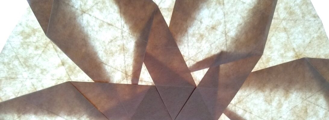
I first saw this model on John McKeever’s Flickr, and think it is a Fujimoto-style set of Escher steps, but the etymology of the model is less clear as it seems to be a variation on a clover-like tessellation, but is deliciously evil in it’s convoluted crease pattern.

I decided I had to try it, but really struggled to understand what the actual floop was going on with the crease pattern – it seemed like the prescribed creases could not co-exist. Naturally I turned to an old trick – I folded a maquette:

After a few days of twiddling with printer paper CP copies until they disintegrated, I finally found a collapse sequence that … somehow … sorted itself out by repeatedly bending back on itself. The real trick was working out which vertices go up and which go down – when you sort that out it is still counter-intuitive … until it isn’t.
I started with a 55cm square of Kraft, using a pencil I divided it into 12th, then trimmed 1 unit off 2 adjacent sides to reduce the grid to 11×11. I then used a stylus to place all the of the pre-creases, ensuring I oriented them mountain/valley as indicated. I was soooo chuffed at how CLEAN the pre-creases were, knowing how important it was to NOT mark some faces that would be solid squares in the final model.
I then had to walk away from it, as pleased as I was with the eventual success on maquettes, committing it to the actual fold is a step that made me oddly nervous.
Continue reading


