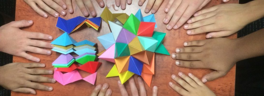
Lunar

Fueled up and having an extra sheet of tissue from the shirts I bought yesterday, I set about being more deliberate in my crumpling.

First up I scrunched the sheet up tightly and randomly, then flattened it – I regret not doing this on the previous square field crumple as it helps refine the end texture I found.

Next, I chose random bits of crockery of different radii, placed them in an aesthetic grouping and then gently eased the paper around the different circumferences (to mark the circles is all). I then removed the china, flipped the sheet and set about HARD creasing the circles.

Next, I gathered all the sharp circle creases together, encouraging the remaining tissue back, away from my gathered edges. I did the same for the smaller circles and brought them together with the large circle edges, then hard crumpled everything (like seriously squished it) back away from the circle edges.

Continue reading

Square Field Crumple

I bought some new shirts yesterday – interleaved inside was some lovely white tissue. I folded it into 3rds, then half to get a square, then half, then half and kept going until I had a small, multi-layered square about 8cm on the side.

Next I crumpled that so the centre of the square was a point. It was tough as there were so many layers. I then opened the last halving, reinforced the valley between, inverted one of the points (as one was up, the other down), and re-crumpled the points.

Repeating this technique, opening a layer, reinforcing the valleys in-between each point, inverting half so they all pointed the same way and re-crumpling, allowing the crumples to become more random as they thinned out.

Continue reading

1122: Pearl Anniversary

30 years ago, the Papermakers & Artists of Queensland (POQ) first formed – in July it was their PEARL anniversary.

As a diverse collective of artists (that allowed me to become a member) we were asked to respond to the notion of “Pearl” to assemble an exhibit of artworks to mark this occasion.

My thoughts, naturally, turned to folding and I was reminded of an organic 3D form I last explored for “The Offering” inspired by the work by legend Paul Jackson.

The idea was simple – using one set of slightly overlapping pleats in one direction, that are then corrugated in the perpendicular direction, you can “tease” dimensionality by “cheating” the overlap with a delicate pull.

Taking a square of trusty Kraft paper, I mocked up a Maquette, pleating and corrugating around a central line, then “MacGyvered” a hinge using simple box-pleating techniques, as I had the notion it should be a “book” of sorts. The hinge mechanism had a natural gutter that allowed me to bind pages securely inside also.

For the production fold, I chose metallicized pearlescent “Terryfoil”, I cut 2x 25cm squares and pleated and corrugated, carefully, then spread the pleats until it achieved the desired curvaceousness.

Continue reading

1117: Mod on a Moped

When you talk of “box pleating”, the young kids in the origami design sphere seem to think they invented it. I was fishing around on the web, for origami-related things as you do, and stumbled across an astonishing scanned page from Neal Elias’ notebook from 1968 that features box pleating:

This is Neal’s “Boy on a motor scooter” – an amazing proto-design from 1968!!!!! (this is all there is, you have to fill in the gaps – it was his personal notebook, the diagrams were all HE needed to fold the model) but what an historical gem of a design. It is doubly interesting because it was designed 3 years before I began my journey in origami as a wide-eyed, clueless 11 year old.

Further research suggests this page was “ripped” from a BOS Publication Booklet 35 (still in print?) called “Neal Elias Miscellaneous Folds – II “, edited by Dave Venables. I have purchased the previous Neal Elias volume but was unaware this treasure exists – it has prototypes of some very famous and completely revolutionary designs indeed (like “The Last Waltz”).

Back in the “early” days of western origami, Elias was a pioneer, realising that by gridding a sheet of paper, then using gridlines and 45 degree connectors you could pleat astonishingly complex structures that could then be shaped into complex figurative models. As a kid, the few models I had access to from him were like crack to me. I mastered the “Elias stretch” (these days I think they call it a ‘pythagorean stretch’) and “Elias base”, making skiers and knights in armor, all from squares.

Many of his designs use odd shaped paper – this model uses an 8×22 grid, and the colour change base is particularly wonderful, leaving all the bits of a person in one colour and a lovely long pleat bundle of alternate colour emerging from him. I can see so much potential of all sorts of things here.

Continue reading

1115: Typeface

Determined to fold something, I came across some diagrams in Origami Dan (an origami-focussed Discord) and figured I would give it a go:

Base unit

The idea behind the the fold is interesting – making, from a square, a 3×4 matrix of “pixels” that can be colour changed either whole or in part. From this base you then strategically reveal colour to form letters of a typeface.

Designed by Jason Ku, it is a clever and flexible shape and I then set out to form all the letters of the alphabet and digits of basic numbers.

Some of the letters represented more challenge than others – some had little fiddly 1/4 triangle components, others had reverses contrary to the underlying structure, requiring some strategic swivels and reverses. the more observant among you will realise I stuffed up the colour conventions and got a few letters in reverse colours to the others (I, J and L for those that did not notice) – meh.

The most time-consuming part of this fold was compiling the photo record and stitching it together – happy I managed it however.