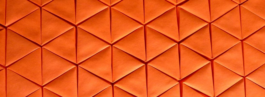
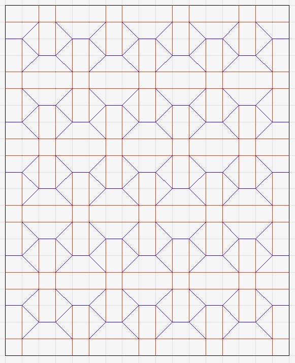
It is common for paper artists to “bind” their artworks into “artist books” – a broad display category that ranges from purely decorative through linear narrative forms, and everything in-between. Having recently made a linear design using cyanotype, inks and paint, it occurred to me that a book-like thing might be a fun way to display it.
Traditional “artist books”, in my observation at least, involve cutting, gluing, sometimes stitching and binding. I wondered if something could be achieved using FOLDS alone.
One “type” of artist book that I know of is a thing called a “Concertina Book”, sometimes including cut and folded “extrusions” which elevate parts of the page. I figured something like this should be possible using folding techniques, so took a scrap of paper and began a fold doodle with a simple fan fold.
Using a pair of pleats running across the fan fold gives me pleat overlaps that can then become “gussets” that then force layers up and off the resting surface in interesting ways. This makes “extrusions” that change the dimensionality of the shape.
At the beginning of the pandemic, I bought myself a copy of Ilan Garibi’s wonderful book “Origami Tessellations for Everyone”, but looking through recently I realised I had not folded many of the wonderful designs before, so set about remedying that:
This is a SINGLE molecule of the “pineapple” tessellation. After a simple set of diagonal pre-creases are imposed on a square grid, the first level collapse is really satisfying. You then have to perform a transformation (essentially turning part of the previously collapsed part inside to create the final structure.
You can then inside reverse the “scales” and you have a lovely form that resembles the body of a pineapple, kind of. The molecule tiles a number of ways – given it lies on the diagonal, you can either tile them in X or O formation – I chose to do a 4-molecule O form, just to see how difficult it was dealing with the interactions, but it turned out fairly easily.
By spacing the molecules correctly, and arranging them in an X you can create a rather lovely “Dish” that is dimensional, stands freely, has a satisfying volume and most importantly gives you free paper to shape pineapple “tops” to act as legs.
It was a fun fold, particularly if you accurately place the pre-creases, and get them in the right orientation (mountain/valley) before you attempt the first collapse. It is a terrific addition to the “what can I do with a square grid” pile.
I must explore more, Ilan’s work is well described, challenging but fun to fold.
The internet (in this case Instagram) sometimes delivers to you by pure chance (or deliberate algorithm) inspiration that is timely:
A recent work (a square-tube based mobius strip) by Henk van der Vorst sparked a curiosity that led me to damaging a few A0 sheets of Kraft paper to explore a tubiform corrugation, and then work out something to do with it.
There is something interesting (for me, recently) in corrugations, and Henk’s work uses simple right-angle hinges, first documented by Paul Jackson, to use a large-scale fanfold without the tiresome necessity of reversing sections of the crease, and allowing you to curve that fanfold onto itself in an interesting way.
I discovered I could hinge on proportions of 6 and 3, making rectangular tubes that articulate and bend in very interesting (the kids would call it “satisfying”) ways.
I fashioned a bunch of different sizes to test the proportions and see just how small I could fold it reliably and accurately. On the large test folds I glued the seam – not sure why, but as I got smaller, the seam just seemed to keep itself shut and become invisible – especially when the tube was twisted.
A Trefoil knot is historically interesting – it is like a set of interwoven mobius strips, and originally was associated with the “Holy Trinity” : the Father, the Son, and the holy GOAT, or something similar. Renditions of it exist in historic engravings, statuary, heraldic depictions – even common images like the Girl Guide logo/symbol … thing.
I have this image in my head, of a petty little orange man, walking in circles because he has not realised he in on a flight of M.C. Escher’s stairs:
Oddly … this abstract concept is not that far from what the petty little orange man is actually doing (but, I do not really understand the lure of a golden ballroom), but I digress.
I first saw this model on John McKeever’s Flickr, and think it is a Fujimoto-style set of Escher steps, but the etymology of the model is less clear as it seems to be a variation on a clover-like tessellation, but is deliciously evil in it’s convoluted crease pattern.
I decided I had to try it, but really struggled to understand what the actual floop was going on with the crease pattern – it seemed like the prescribed creases could not co-exist. Naturally I turned to an old trick – I folded a maquette:
After a few days of twiddling with printer paper CP copies until they disintegrated, I finally found a collapse sequence that … somehow … sorted itself out by repeatedly bending back on itself. The real trick was working out which vertices go up and which go down – when you sort that out it is still counter-intuitive … until it isn’t.
I started with a 55cm square of Kraft, using a pencil I divided it into 12th, then trimmed 1 unit off 2 adjacent sides to reduce the grid to 11×11. I then used a stylus to place all the of the pre-creases, ensuring I oriented them mountain/valley as indicated. I was soooo chuffed at how CLEAN the pre-creases were, knowing how important it was to NOT mark some faces that would be solid squares in the final model.
I then had to walk away from it, as pleased as I was with the eventual success on maquettes, committing it to the actual fold is a step that made me oddly nervous.
I seem drawn to corrugations lately – there is something cathartic about folding such geometry, and this one, designed by Boice Wong is very satisfying to play with:
Although the CP and demo from Boice is based on a 24 gridded square, it is possible to expand the pattern infinitely on the long axis – I decided to try it as a 2:1 rectangle and found it fairly easy to fold accurately. The collapse, although a little more exhaustive, is none the less straightforward.
This corrugation is a self-sealing “tube-like” construction that folds back on itself – I think there is a more positive lock possible, but this works fine. The base structure is a crenellated plus (+) sign, that you then shape the arms using a series of inside reverse folds.
Once collapsed, and flexed a little, it becomes deliciously bendy – you can transform it in a variety of ways, twist it tightly and then it collapses back into a compact stack form – what fun.
I have been enjoying exploring curved folds recently and an idea came to me:
I designed 3 complimentary “wavy” line patterns using Affinity Designer. They were designed on A4 and A5 templates. I printed them out and used them as score templates for pieces of 180gsm watercolour paper.
Hand-scoring curves is fraught with non-smoothness moments, but the watercolour paper was forgiving enough that, when laying in the creases, I was able to round out the little lumpy bits.
This is a Triptych – the 3 panels relate to each other, and could be smaller sections of a larger rippling mill pond.
There are many legendary folders out there and, thanks to the Interwebs, it is possible to connect with many of them via socials (and rare cases in the real world – wherever that is):
I am obsessed with the intricate sculptural pleat work of Goran Konjevod (@foldsome), and love playing in the space of densely pleated paper.
This piece, inspired by a piece from Goran, started as a 12:1 rectangle. With regular mountain divisions (1/2, 1/4…) until the creases were just over 1cm apart. I then successfully guestimated a tight and completely circular SPIRAL by pleating each mountain on the same angle, creating a lovely rosette.
Next, using a padded surface, on the reverse I scribed an irregular spiral track from centre out to edge.
We are all very familiar with planar geometry – we see, for instance, a square or rectangle is a plain shape with all 4 corners being right angles (90 degrees). Curved space gets a LOT weirder:
It is possible, for instance, to construct a shape on a curved surface that has 5 (or even 6) corners, each having a right angle. Origami typically deals with sheets that start flat – a non-flat sheet affords fascinating properties.
After a conversation with Goran Konjevod (@foldsome), I wanted to try a technique he pioneered involving radially pleating such a non-Euclidean square.
With so much going on, sometimes I need a fold I can lose myself in. One of many origami designers in my “GOAT” list was Eric Joisel. I have folded lots of his models, and often return to them – deceptively simple, terrifyingly technical, breathtakingly artistic.
As a sculptor turned Origami enthusiastic, his designs were “breathed into life” by the hands of a master – I would love to have even a fraction of his creative genius.
I have folded Joisel’s snail a few times before. Indeed, immediately prior to this version I folded a version of the fold, but hated the proportions, lack of head and impossible to balance fall-apart shell.
Re-thinking my approach, I attacked a 3.8×0.15m strip of 60gsm Kraft paper differently. I allocated space for the head – top and bottom separated by box-pleated feelers/eyes, leaving enough for a tail. The previous attempt started with the shell and that created issues as I had insufficient paper to properly form a head.
One of many issues with long-term storage/display is the nature of the material itself – paper.
Most origami paper is not acid-free, meaning that over time the colours change as oxidation and UV damage take their toll on what is essentially a fragile material. Moisture and humidity conspire to “unfold” folded paper, causing it to want to return to the flat state, unless wet-shaping has been used to change the “memory” of the sheet fiber orientation.
Many models are not self-standing, so stands or other tricks are necessary to allow them to present upright – I have used both plastic clip stands and more permanent wire armature bases.
For the presentation/display model of Sampreet Manna’s beautiful new Peacock, I have used a few techniques to stabilise it in readying it for display (September – December I typically have display cases of my work in Suburban libraries).
This model is top-heavy – although the legs are pretty life-size in terms of the body proportions, they are spindly and the claws are not wide-spread enough for the model to self-support. I took some heavy gauge anodised aluminium armature wire, covered it with paper offcut from the sheet I was working with (“Earth” Tapa Duong Vietnamese fiber paper from @oritube_master ‘s shop) using PVA glue. Covering the wire with paper first makes adherence to the main model much more securely.
Once the wire segments had dried I then buried them deep in the pleats that made up the legs, closing the layers as I did using PVA glue dabs and then clamping it all in place whit it dried. The result is now that the model is help up by the leg wires, allowing me to permanently pose the “knees and ankles” without compromising the model stability.
Additionally, adding small PVA glue dots inside seams stops them from opening back up and greatly contributes to the long-term stability of the pose. I do not think this is as “cheaty” as bathing the model in MC and wet-sculpting it, like many origamists do. I have employed wet hands while shaping as a more gentle (and authentic) wet-folding technique and indeed some of the nice organic smooth curves achieved on this model were done that way. By wetting the paper, positioning it and then letting it dry the more subtle shapes become permanent,
The base this time was a white plastic lid from an empty container that was being recycled. I covered it with hand-made Kozo/cotton/day lily blend paper I made a few years ago – a lovely contrast that was interesting but not too busy as to distract from the already visually striking paper the model is folded from. Selecting a suitable base – be it a round lid or a plinth made from foam core can greatly enhance the stability of the model and give it a “finished” look.
The wires are punched through the top of the lid, bent tightly underneath and held with layers of gaffer tape and self-adhesive foam-core to make it feel “solid” and stable.
I am really happy with this piece, another model I am happy to display.
Currently I am editing a new book by Sampreet Mana, and when I saw his Peacock, I knew I wanted to test-fold it:
As a kid, one of the first models I committed to memory was Adolfo Cerceda’s Peacock, folded from a 2:1 rectangle.
Sampreet’s design starts as a square, and you begin with the head plume, then form the rest of the model around this. I followed one of the suggested paper recommendations (50cm Damul Kraft), but wish I had a better colour (ideally blue/green) – I may source more appropriately coloured paper and re-fold this – we shall see how time works out.
With supercomplex models, my fold philosophy is “fold until you finish or fail” – knowing full well that either way I am learning – every fold teaches you something.
There are LOTS of complex steps, and some really interesting manipulations that isolate the tail, elongate the body and separate wings, lefts etc – I am really impressed with the structure of the model. The resultant model eats paper like crazy, but most of the bulk ends up in the middle of the body, giving it a natural weight and thickness and making final shaping and layer stabilization easier.
Having folded Robert Lang’s masterpiece Cactus, when I saw Daniel Brown had designed a smaller version based on a 31 square grid, I knew I would be folding that sometime:
I have been really into time-consuming surface deformations, corrugations and tessellations lately – whether it is procrastigami or the need for a time-sponge, pushing paper into amazing regular shapes is just fascinating to me.
I threw a 50cm square of glossy duo green/natural Damul Kraft paper from origami-shop.com at this design, but the resultant fold is tiny – few tessellations eat paper like this one. The rows of prickles are raised via overlapping pleats in an astonishing collection of cooperating maneuvers where accuracy and thickness is everything.
My previous fold was rendered from a 90cm square of Kraft that I painted after it was folded. The thickness make point sharpening really challenging. This fold using Damul Kraft made the fold much easier because the paper was thin and tough. The scale of the fold here is also smaller – a real challenge for my nerve-damaged and clumsy fingers.
My feeds are full of origami – mine and others – one origami artist that consistently pops up on my insta suggestions is @D.Hinklay:
I was drawn to his columnar corrugations, particularly “Prop 4” and “Prop 2” – they reminded me a lot of works of Huffman, Resch and many other origami legends, so decided I wanted to try them.
I committed a large sheet of duo Kraft paper, laid in a mountain-fold grid, strategically added zig-zags of valley folds, then began orienting folds.
The corrugation, like some fun folds, is an “all at once” collapse as you bend the sheet into a column – the creases then reinforce each other in very pleasing ways.
If you have been paying attention, you would know i am a member of PAQ – Papermakers and Artists of Queensland. in 2025 we are mounting an exhibition that explores contemporary interpretations of the scroll, entitled “On a Roll”. I decided that I wanted to mount a FOLDED scroll as one of my submissions, and envisaged a massive tessellation:
I needed a theme, and a style. For a theme, I decided to try and “tell” the progression of the first year of the recent Covid-19 pandemic … because I could see a sequence of “blossoming” outbreaks that progressively “break” regular society.
The style choice was more complex – I love the aesthetic of Lacquerware – the Chinese/Japanese technique of covering simple materials in coatings of red lacquer, texture and patterns. I also wanted to have hints of “Kintsugi” – the Japanese technique of fixing broken pottery using lacquer and gold.
I chose red/natural Kraft paper because the red reminded me of the lacquer aesthetic, and the natural grounds the work in a common/everyday material. I selectively also introduced gilded elements into the finished folded work – symbolising the “patching” of the broken world – I went for a really minimal touch here, arguing less is more. Read further….
Doom-scrolling on Insta, as you do, I came across an astonishing reel by Kimiro, featuring a new design for a snake resting on a branch.
I was determined to fold some version of this design, but knew I did not have the paper (large enough) or the patience for a 128 grid (with partial 256ths) grid-based scaled-shaped model. So I scaled down – working out the minimum size scale I could reasonably shape consistently, then working out how much of a 70cm square duo sheet of Kraft would be the snake.
The design is ingenious – an 8-grid strip down the diagonal of a square becomes the snake, the rest of the paper becomes the colour-changed branch. One consequence of re-scaling the snake was that the paper allocated to the branch diminished to barely protruding from the snake’s body – so I thought “fuck it” and tucked it inside (like the layers of waste paper in a Ryujin) to give the body bulk, allowing me to fashion a lower jaw and forked tongue.
Another consequence of re-factoring the snek was that it’s overall length is diminished to almost comic proportions. This little guy is a grower, not a shower, indeed.
Accepting that the project was cursed from the beginning (by my lack of commitment 😛 ) I decided to just go for it, treating the fold as an exercise in precision. Pre-creasing took an age, then scale collapse went smoothly. I then pre-creased all the scale-shaping also took an age, not nearly as long as the actual scale-shaping however. My Ryu Jin 3.5 PTSD returned at times, causing me to walk away from the project a few times.