1123: Anubis

I have always been fascinated by Egyptian symbology, myths and ancient artforms. The very pictorial style is angular, stylised, often animal-based and very interesting. Anubis is the god of funerary rites, protector of graves, and guide to the underworld, in ancient Egyptian religion, usually depicted as a canine or a man with a canine head:

I am currently watching STARGATE, a few episodes at a time with my son. I began watching it back in the days of free-to-air broadcasting but, for whatever reason I stopped (prolly because I had a life and no longer had time/access to episodes). The series premise is interesting, and I particularly love their hijacking of Egyptian gods/mythos as the “baddies”, as well as the whole aesthetic.

I wish I could remember where I first found this Crease pattern (CP). It has been in my “must try this, sometime” pile for a couple of years and I finally got around to it when looking for something to fold with my second bit of treated Wenzhou rice paper (not made of rice, is a fine and resilient mulberry). I also wish I knew the designer – can anyone help me out here as I would love to give proper attribution?

The CP seemed pretty straight forward – indeed the collapse was quite natural (I did not do my usual “parachuting” as I tried to collapse key details in the order that seemed most logical), and resulted in a base with a myriad of stickey-outey parts in more or less correct locations. I am so pleased with my developing CP solving skills – a loooooong way to go, but every success encourages me further.

Continue reading

1121: Santa/Satan

Comes the time of year when we tell little kids that a morbidly obese stranger in a red suit breaks into their house (by coming down a chimney or other entry point if there is no chimney), eats some random snack, feeds a portion of that snack to a reindeer (who has a birthmark on it’s nose) and then leaves presents, regardless of whether you have been an entitled little shit all year, or a saint:

As a parent I was complicit in this lie until my kids (fairly early on) cottoned on to the fact that this whole thing was so very unlikely, and merely a mechanism for justifying a mound of presents under the xmas tree.

I wanted to try out the new paper pack of Satogami I got from Origami-shop and this festive fold seemed like the perfect opportunity given the latest Tanteidan magazine (which contains it’s diagrams) arrived this week also.

Duo Satogami is quite thick. I bought a paper pack of 58cm squares, mixed colours and love the vibrancy of the red/white, and also love the texture of the paper. I _want_ to report that pre-creasing Satogami was easy … but … I really struggled to my the reference folds and to fold accurately because of the thickness and texture. The paper reverses fairly poorly also (meaning I had to correct lots of folds for accuracy as I went to ensure alignment of layers and edges during more complex moves.

Continue reading

1120: Steven Casey’s “Numbat”

Occasionally I am privileged to be asked to test-fold new models, and I jumped at the chance to fold this Numbat:

As far as I can see, this is the first depiction of this native Australian insectivorous marsupial in origami and the design captures the morpohology and proportions really well.

Starting with a preliminary base, then folding a skewed birdbase, the side stripes naturally emerge in cleverly controlled colour changes, along with the legs, neck and ant-eater-like snout, along with a lovely bushy tail.

I folded this chap from a 40cm square of white/natural Kraft paper (some of my last from the Ikea stash – I wish they sold it again, great stuff) and the fold sequence was fun – some really interesting moves and a good range of skills necessary to complete the model neatly.

Continue reading

1119: Pocket Godzilla

Leafing through one of the origami books I helped edit, I came across a cutey little “Godzila”esque model I had not folded:

Designed by Oriol Esteve, from his book “Fold with the Flow”, this charming little Chibimonster seems ready to terrorise Tokyo and dodge nukes as the ineffectual army fights back.

I used to watch monster movies with a passion, and the old “guy in a rubber suit” versions were terrifying as a kid, but the whole Godzilla franchise seems to go on and on with re-imaginings and various levels of tech in the VFX often getting in the way of the story, at least these days.

I had a 25cm square of blue metallic paper (I think from a sample pack from Origami-shop) that was light blue on the reverse, so decided to torture it into shape. The book suggests Kami, and thinner paper would have made some of the moves less thick, but I think I like him chunky. It is a fun design, starting with one of Oriol’s much-used bases. I like that both the eyes and the back spikes are colour changed. The proportions are nice and I also like that he free-stands because the centre of gravity has been considered in his pose.

1118: Riccardo Foschi’s “Human Bust”

I virtually attended OWM4 (Origami World Marathon 4) recently – one of the classes I attended in the wee hours of the morning was a workshop run by Riccardo Foschi:

Riccardo has a recognisable style and his models are a delight to fold (you will find lots of them in this blog). This stylised human bust has such a serene expression on their face, I knew I wanted to try it.

My fold live in the workshop was ok, but re-visiting it when I had some more time (and better understood the fold) resulted in a nicer overall model.

I had recently purchased some “Shadow Thai” paper from Origami-shop.com and thought it would be a good fit for this model.

I chose a grey/smoke blue sheet (black on the reverse, it is a duo paper) and figured because it is a little thicker that it would help with the statuesque quality of the design.

Continue reading

1117: Mod on a Moped

When you talk of “box pleating”, the young kids in the origami design sphere seem to think they invented it. I was fishing around on the web, for origami-related things as you do, and stumbled across an astonishing scanned page from Neal Elias’ notebook from 1968 that features box pleating:

This is Neal’s “Boy on a motor scooter” – an amazing proto-design from 1968!!!!! (this is all there is, you have to fill in the gaps – it was his personal notebook, the diagrams were all HE needed to fold the model) but what an historical gem of a design. It is doubly interesting because it was designed 3 years before I began my journey in origami as a wide-eyed, clueless 11 year old.

Further research suggests this page was “ripped” from a BOS Publication Booklet 35 (still in print?) called “Neal Elias Miscellaneous Folds – II “, edited by Dave Venables. I have purchased the previous Neal Elias volume but was unaware this treasure exists – it has prototypes of some very famous and completely revolutionary designs indeed (like “The Last Waltz”).

Back in the “early” days of western origami, Elias was a pioneer, realising that by gridding a sheet of paper, then using gridlines and 45 degree connectors you could pleat astonishingly complex structures that could then be shaped into complex figurative models. As a kid, the few models I had access to from him were like crack to me. I mastered the “Elias stretch” (these days I think they call it a ‘pythagorean stretch’) and “Elias base”, making skiers and knights in armor, all from squares.

Many of his designs use odd shaped paper – this model uses an 8×22 grid, and the colour change base is particularly wonderful, leaving all the bits of a person in one colour and a lovely long pleat bundle of alternate colour emerging from him. I can see so much potential of all sorts of things here.

Continue reading

1116: Alas….Homo Papyrus

Things have been busy, lots happening in the real world so it is sometimes nice to get lost in a fold or two:

This lovely fully 3D skull, designed by Naito Yukata and wrangled from a 3:1 rectangle has been quite a journey.

The pre-creasing was fiddly but laid in landmarks that then aided the staged collapse. I found it easier to collapse parts of the model separately, then open the sheet back out to do the next section, laying in the final resting creases as I went – this meant that the “all at once collapse of the top part of the skull was easier.

The teeth introduced a lovely layered pleat structure I had not seen before and the overall shaping is a bit of an art I think.

Continue reading

1113: Shore Crab

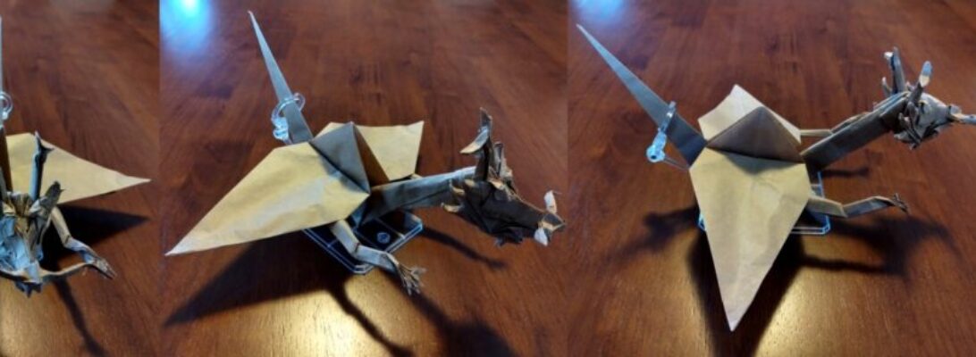
When tidying my JOAS Tanteidan Magazines, I discovered a special edition that members used to get – one issue in particular has 2 terrifyingly complicated models I have not (to my surprise) ever tried:

This is Hideo Komatsu’s glorious “Shore Crab”, an amazing but intense design that is described in a fascinating sequence of diagrams. They are involved, number 194, and involved many advanced techniques, and in retrospect I probably looked at it at the time I got it and mentally added it to my “try later” pile.

I started with a 50cm square of crispy Kraft, and adopted my usual fold it until it either fails or finishes.

To my delight, the logical sequence and time to be accurate and careful resulted in a clean fold which I absolutely love. The resultant crab is plucky, has bulk (indeed, most of the paper is folded inside) and is just so anatomically crabby.

It takes great skill to design a model that closely resembles the silhouette of a figurative subject. It takes a special sort of genius in design to ensure that the model looks like the subject all the way around – the underside has all the features of a crab also – just brilliant.

I made a little clear acrylic stand that snugly slots into the crab’s carapace, enabling it to stand up like it is either walking or challenging and, I added some tiny spots of glue to keep seams from gaping all that was necessary to present the fold.

Continue reading

1111: Goldfish

Cleaning my desk is an important psychological activity, it helps me “move on” and, oddly, I had not cleaned my home desk since well before I retired … I am not sure why, but I just was not ready:

The cleaning process also de-clutters, re-homes and generates a pile of detritus headed for the rubbish bin. Among the accumulated layers of life I discovered a printed diagram from Pham Hoang Tuan for a lovely ornate goldfish.

I remember being sent a bunch of printed diagrams with a paper pack from him (I won it for … something I cannot remember), and realise I have yet to fold most of that hand-made and hand-coloured paper … must do something about it.

I approached this model like most – I first grabbed my goto test-fold paper (Kraft), decided to try a 30cm square and set of, reasoning that I will either finish it or fail trying – both are useful journeys.

Like many diagrams from Pham Hoang Tuan, I found some inconsistencies between what was being asked and what you had to do that with, but as a reasonably experienced folder I was able to “creatively” step over those weirdnesses.

This model is lovely, and screams for pretty, textured, thin paper – so I must re-visit it with the same. Like Ronald Koh’s Goldfish, this model is volumetric (it is chubby), has a profusion of fins and the shaping requires a deft, delicate touch. I love the formation of the eyes and separation of the fins, a symphony of bizarre genetic engineering designed to create fan-tailed delicate ornamental goldfish.

It contains a number of seemingly impossible closed-sinks to shape the body and create volume, but the net result is quite beautiful – one I will return to.

1110: Origami World Marathon 4

I have recently completed the mammoth 50hr+ live fold-along festival called The Origami World Marathon. I folded as many as I could physically attend, and it is a super rare privilege to be actually taught by such world class designers.

I managed about 14 models live, slept some and can complete those missed because, as part of the purchased ticket I gain access to video tutorials from the designers for the next year – win, win.

Continue reading

1109: Bảo Long’s Spider

Nothing makes you feel old like stumbling across a delicious, simple new design from an 11 year old:

This is Bảo Long’s design, which appeared on one of the Fakebook groups I am a member of (https://www.facebook.com/groups/366246184054415). I am amazed this did not exist before as the separation of legs and abdomen/cephalothorax is so natural.

Folded from a 20cm square of Tuttle indigo duo paper, lovely sequence, terrific and pretty quick also.

EDIT: I just noticed it only has 6 legs (pretty sure I can find more), I guess 11yolds cannot count these days 😛

1106: PBS Scorpion

One of the benefits of working as part of the editing team on an origami book is that you get to see models before they are in the wild:

This is my test fold of Peter Bucan-Symons new “Scorpion”, a delicious model with a fun challenging fold sequence.

I folded this from a 60cm square of black/natural duo kraft paper (some of my dwindling stock of Ikea duo – WHY won’t they stock this anymore????).

Continue reading

1105: En Garde

It is a wonderful thing when designers share their processes, crease patterns and diagrams. Boice Wong is one that readily shares the CPs of his amazing designs, and when I saw “Sword and Shield V2”, I knew I had to give it a go:

Although I have been folding for decades, most of what i have folded has been from DIAGRAMS (step by step folding guides). By far the MAJORITY of origami out there does not exist as diagrams, but a larger proportion exist as CPs (crease patterns). I have been, over the last few years, working on my crease pattern solving skills.

This model is based on Boice’s 24 grid CP, and the collapse is relatively straight forward. Sometimes CPs give you crease orientations (red=mountain, blue=valley), sometimes not. The skill comes with deciding which creases to impose first as part of the collapse. Sometimes it does not matter, most it does, some you can derive based on “knock on effects” on one crease that causes the orientation of a sequence of subsequent creases. Sometimes it is pure witchcraft.

Continue reading

1104: BE the Water

For the last few years, over what was the Christmas holiday school holidays, I have gone lap swimming at a 50m pool near(ish) me. I always intended to continue into the year, but work and lane availability (due to squad training) at the times I could go always got in my way:

Having recently retired, I have been able to continue right into winter (the pool is indoor, it is heated) at a time that suits me, and choose to do it as one of my activities on Wednesdays. It is part of a broader activity set that is hopefully keeping me fitter and a little less fatter.

I first saw this lovely, simple, perfect design on Joseph Wu’s Facebook feed. It is a rare privilege to have one of Joseph’s designs shared step by step, and knew it was something I HAD to fold. It perfectly captures that delicate balance between clawing through the water, and drowning. The model is taking a breath on the left-hand side. This is something I struggle to do due to neck vertebrae fusion (for some reason right-hand breathing is easier). Swimming is a gentle exercise that is gradually giving me back some of the movement lost since the neck re-build.

I folded the model from a piece of Tuttle indigo dye duo paper that has a pattern that closely resembles the ever-changing abstract water caustics I swim through every time I get in the pool. I love the simplicity but also the accurate depiction of that, a very human act of swimming.

1103: Brian Chan’s “Walking Locust”

This model has been on my “must fold” for ages, but I had only ever seen a CP and could never make head nor tail of the design. I saw a rendition on Origami Dan Discord and, after an enquiry it turns out there exists an unofficial diagram, drawn by Hua Ge that guides folders through this terrific insect:

I split a sheet from a new 60cm roll of medium weight Kraft and began folding. There is a load of pre-creasing, primarily setting up the high-density collapses to make the long thin legs, so accuracy early on pays dividends later.

Uncharacteristically, this model uses loos pleat structures to bulk out the body, define the wing covers and head/thorax/abdomen, with a deliciously complex un-sink to make the head-thorax join. Interestingly this model also has a super-detailed head/face – it reminds me so much of the hoppers in “A bugs life”, and it has real “cute” personality, as much as a locust can be cute.

Continue reading