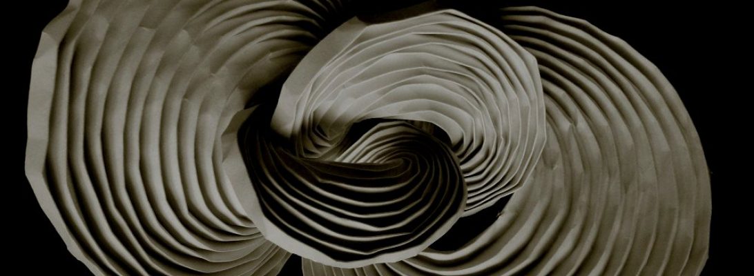
One of the privileges of being on the edit team for Origami Shop is that I get to see new designs before they are in the wild:
Part of the edit process, often, is test folding the model. I do not need to do this, usually, because there is also a team of test-folders, but I like to check the instructions and how they work – it can inform better diagrams.
I have a recent stash of hand made (from plant to sheet) Kozo tissue I was itching to try on a fold.
This Koi Carp, designed by Yery J. Astroña, will be part of a forthcoming book – it is a 182 step sequence, so I thought (rather naively) … why not?
I had no idea how the paper would take folds – there are 3 pages of pre-creasing before collapse, but I figure I would fold until I finish or it failed – either outcome I can learn from.
To my delight, my paper (a 28cm square liberated from an A3 deckle-edged sheet) was completely stable – no sign of fatigue at the end. It takes creases pretty well, reverses those creases nice and accurately. It is crisp, thiiiiin, and softer than Kami, but I found it completely foldable. It wet-shapes beautifully – very satisfying experience indeed.
Last PAQ meeting I had the privilege of running the group’s Hollander Beater, processing my most recently cooked and cleaned paper mulberry pulp. In the past I have hand-beaten it, but was determined to give the mechanised processing a try (to see if I could).
The pulp floofed up into delicious clouds of softly frayed pulp after a few hours circulating in the beater. I took the beaten pulp home, rinsed it a couple of times and then pressed it into pulp storage sheets. I ladled 3 x 2L scoops of pulp into my old A3 mould and deckle, smoothing it off with my hands, then added them to my press, couching between. The batch made 6 such sheets.
After pressing, these pulp sheets were set to dry over the next week – when dry they are storage stash stable.
For the tissue session, I re-hydrated one of these sheets in a tall bucket, tearing it up until it was finely shredded. I then agitated it with my electric drill and a paint-stirrer attachment until it was separate and fluffy again. I brought the bucket of pulp and most of my sheet forming equipment to the PAQ meeting last Sunday and set up a bit of a production line.
I have a large vat (so I can easily move my A3 frame in it), and half-filled it with water. Then added 2 scoops of pulp to the water in the vat, along with half a bottle (about 100ml) of pre-prepared Methyl Cellulose (MC) gel and about 200ml of strained Okra mucilage. The MC was to act as an internal size for the paper (to help with the strength and crispness). The Okra mucilage acted as a suspension aid to keep the pulp from quickly sinking to the bottom of the vat.
After a thorough mix to fluff up and evenly distribute the relatively sparce pulp in the water, I was able to pull sheets by catching the “clouds” that so delicately hung in the water.
With so much going on, sometimes I need a fold I can lose myself in. One of many origami designers in my “GOAT” list was Eric Joisel. I have folded lots of his models, and often return to them – deceptively simple, terrifyingly technical, breathtakingly artistic.
As a sculptor turned Origami enthusiastic, his designs were “breathed into life” by the hands of a master – I would love to have even a fraction of his creative genius.
I have folded Joisel’s snail a few times before. Indeed, immediately prior to this version I folded a version of the fold, but hated the proportions, lack of head and impossible to balance fall-apart shell.
Re-thinking my approach, I attacked a 3.8×0.15m strip of 60gsm Kraft paper differently. I allocated space for the head – top and bottom separated by box-pleated feelers/eyes, leaving enough for a tail. The previous attempt started with the shell and that created issues as I had insufficient paper to properly form a head.
My previous folds were with plain Kraft paper, but I decided I wanted to show off the clever colour changes implicit in the design, so re-folded them with White/Natural Kraft paper over the last week or so.
Having released only Crease Patterns (CP), part of the delicious challenge of this pair of models is working out what becomes what. Although related, the 2 models use CP variations that both allow for the formation of a box head, one attached to shoulders, the other not.
I had a cut-off scrap of Kozo, so decided to try remembering how to fold the Peacock I memorised as a 12 year old:
To my delight, the fold sequence was still accessible in my crowded brain. I remember that I committed a bunch of models to memory, and folded them relentlessly – I had few resources back then, and the designs available to me was really limited (this was pre-internet, and access to books on origami in Maleny, a small country town, was really limited).
I cleaved a roughly 2:1 rectangle from the most damaged part of the sheet (as I was couching it onto the glass sheet, a huge air bubble formed then popped) causing the hole. I set about forming the bird’s head and body from the most solid end, tail from the rest – the hole is nicely hidden in the ruffle of the tail.
In research it seems this design was controversial – Akira Yoshizawa claimed he designed it first, but the timeline suggest this is not the case. Although he was a design legend, he seemed unable to accept that someone else could come up with a design idea that matches (mostly) his own. There was a bit of a flame war about the model in the press. Read about this controversy here.
I added a head frill because … reasons. I intend to display this model beside the more recent peacock so wanted the models to be morphologically similar. This is an action model – you can push the tail up and it fans out in full display – clever “traditional” design.
Once again I am a little chuffed about how well my hand-made kozo tissue takes and holds folds. This is paper made from finely beaten kozo (paper mulberry) pulp – dispersed in water, caught on a mesh mould, pressed to remove some of the water, dried on glass. Nothing else – no treatment, nothing.
Wow, just wow – LOOK how small and perfect it is. I made 5 sheets, a couple of different techniques but it is all crisp, rattly and strong – cannot wait to fold it.
I have been making Mulberry tissue, and wanted a non-trivial model to test the foldability of the untreated sheets. I remember finding @taniiiii_ori ‘s Fractal Crane CP on Twitter ages ago, so decided it was perfect – based on a traditional fold, with a modern complex twist:
I picked the first sheet of tissue I pulled from my vat of freshly beaten kozo pulp – it was imperfect, painfully thin but none the less lovely. I cut the largest square I could from the most solid end and then set to laying in pre-creases for an n=2 fractal.
The CP is easily extended to add new levels, but the folds get impossibly fiddly exponentially – an n=2 was a good compromise I thought.
I was delighted to find that the paper took the pre-creases well, with no visible fatigue as I exposed the sheet to torsion and tension making the fiddly folds in the central gutter. Once creases were in and oriented correctly (mountains or valleys depending on their job) , the collapse began. The small bird-bases collapse and that allows the central gutter to form naturally around them.
One of many issues with long-term storage/display is the nature of the material itself – paper.
Most origami paper is not acid-free, meaning that over time the colours change as oxidation and UV damage take their toll on what is essentially a fragile material. Moisture and humidity conspire to “unfold” folded paper, causing it to want to return to the flat state, unless wet-shaping has been used to change the “memory” of the sheet fiber orientation.
Many models are not self-standing, so stands or other tricks are necessary to allow them to present upright – I have used both plastic clip stands and more permanent wire armature bases.
For the presentation/display model of Sampreet Manna’s beautiful new Peacock, I have used a few techniques to stabilise it in readying it for display (September – December I typically have display cases of my work in Suburban libraries).
This model is top-heavy – although the legs are pretty life-size in terms of the body proportions, they are spindly and the claws are not wide-spread enough for the model to self-support. I took some heavy gauge anodised aluminium armature wire, covered it with paper offcut from the sheet I was working with (“Earth” Tapa Duong Vietnamese fiber paper from @oritube_master ‘s shop) using PVA glue. Covering the wire with paper first makes adherence to the main model much more securely.
Once the wire segments had dried I then buried them deep in the pleats that made up the legs, closing the layers as I did using PVA glue dabs and then clamping it all in place whit it dried. The result is now that the model is help up by the leg wires, allowing me to permanently pose the “knees and ankles” without compromising the model stability.
Additionally, adding small PVA glue dots inside seams stops them from opening back up and greatly contributes to the long-term stability of the pose. I do not think this is as “cheaty” as bathing the model in MC and wet-sculpting it, like many origamists do. I have employed wet hands while shaping as a more gentle (and authentic) wet-folding technique and indeed some of the nice organic smooth curves achieved on this model were done that way. By wetting the paper, positioning it and then letting it dry the more subtle shapes become permanent,
The base this time was a white plastic lid from an empty container that was being recycled. I covered it with hand-made Kozo/cotton/day lily blend paper I made a few years ago – a lovely contrast that was interesting but not too busy as to distract from the already visually striking paper the model is folded from. Selecting a suitable base – be it a round lid or a plinth made from foam core can greatly enhance the stability of the model and give it a “finished” look.
The wires are punched through the top of the lid, bent tightly underneath and held with layers of gaffer tape and self-adhesive foam-core to make it feel “solid” and stable.
I am really happy with this piece, another model I am happy to display.
Currently I am editing a new book by Sampreet Mana, and when I saw his Peacock, I knew I wanted to test-fold it:
As a kid, one of the first models I committed to memory was Adolfo Cerceda’s Peacock, folded from a 2:1 rectangle.
Sampreet’s design starts as a square, and you begin with the head plume, then form the rest of the model around this. I followed one of the suggested paper recommendations (50cm Damul Kraft), but wish I had a better colour (ideally blue/green) – I may source more appropriately coloured paper and re-fold this – we shall see how time works out.
With supercomplex models, my fold philosophy is “fold until you finish or fail” – knowing full well that either way I am learning – every fold teaches you something.
There are LOTS of complex steps, and some really interesting manipulations that isolate the tail, elongate the body and separate wings, lefts etc – I am really impressed with the structure of the model. The resultant model eats paper like crazy, but most of the bulk ends up in the middle of the body, giving it a natural weight and thickness and making final shaping and layer stabilization easier.
Being an active member of an online community has many benefits. Origami communities often share diagrams, and this model was shared this morning on fakebook:
This is Ryosuke Sakurei’s “Dragon Baby”, a gorgeous little flapper that is pretty clever in it’s design. I searched for published sources, but it seems the Fakebook poster must have shared diagrams from a source I cannot identify.
I used one of my old-stock thick Shadow Thai sheets – green/black duo, a 40cm square, and the design allows that quite heavy paper to be folded neatly.
It is often that thickness of paper prevents you from completing models – well designed ones make allowances, and this is an example of one that is well designed.
The subtle use of colour change, the chunky volumetric body and the proportions are just lovely. I am very happy with how this turned out. The sequence is clear, fun and relatively straightforward, but it sucked me in so completely that I did not take any progress pictures, sorry.
Having folded Robert Lang’s masterpiece Cactus, when I saw Daniel Brown had designed a smaller version based on a 31 square grid, I knew I would be folding that sometime:
I have been really into time-consuming surface deformations, corrugations and tessellations lately – whether it is procrastigami or the need for a time-sponge, pushing paper into amazing regular shapes is just fascinating to me.
I threw a 50cm square of glossy duo green/natural Damul Kraft paper from origami-shop.com at this design, but the resultant fold is tiny – few tessellations eat paper like this one. The rows of prickles are raised via overlapping pleats in an astonishing collection of cooperating maneuvers where accuracy and thickness is everything.
My previous fold was rendered from a 90cm square of Kraft that I painted after it was folded. The thickness make point sharpening really challenging. This fold using Damul Kraft made the fold much easier because the paper was thin and tough. The scale of the fold here is also smaller – a real challenge for my nerve-damaged and clumsy fingers.
Grinding through my “must fold” pile, I decided to work on the modular “Taj Mahal” designed by Valentina Minayeva:
I am a member of PAQ (Papermakers and Artists QLD) and this month’s meeting was all about “working with colour” – as I am not really into painting, stitching and similar, the closest I get to colourful “collage” is multi-colour kusudamas, and this is a beauty.
A relatively simple bi-colour unit combines with adjacent units to make some fascinating emergent geometry – we see colour wheel points, and tri-colour cubes emerge from the tangle in fascinating and delicious ways.
Unlike many kusudamas, this one has a relatively simple unit locking mechanism – the tabs positively lock into the pockets – the REAL challenge is colour distribution.
I decided on 5 colours (because it is a 5’s and 3’s type construction (5 units connect to make a swirl of a point, and adjacent modules dock in 3s). So I needed 6 sheets of each of the 5 colours to make a total of 30 units. The first swirl dictated EVERY other placement, as the next unit to add is the colour of the one on the opposite side of the structure. Once I saw that, it was a bit of a 3d jigsaw puzzle from hell, but satisfying.
My feeds are full of origami – mine and others – one origami artist that consistently pops up on my insta suggestions is @D.Hinklay:
I was drawn to his columnar corrugations, particularly “Prop 4” and “Prop 2” – they reminded me a lot of works of Huffman, Resch and many other origami legends, so decided I wanted to try them.
I committed a large sheet of duo Kraft paper, laid in a mountain-fold grid, strategically added zig-zags of valley folds, then began orienting folds.
The corrugation, like some fun folds, is an “all at once” collapse as you bend the sheet into a column – the creases then reinforce each other in very pleasing ways.
One of many design techniques used in Origami (and other aspects of life) is Iteration.
I decided I wanted to make an Origami approximation of a Mitsubishi Triton with a “camper trailer” modification.
I did some rifling through my Origami reference collection and found in the OUSE Convention book a lovely base “Jeep” model, designed by Stefan Delecat.
Folding it gave me some useful widgets for isolating tyres, windscreens and integrating them into a car body … but … it was the wrong shape. On the folded maquette I penned areas that needed expanding and contracting. Unfolding that maquette I was able to see where “grafts” were necessary. A GRAFT is the addition of extra paper to enable a feature – it ahs knock-on effects however of requiring you to deal with the extra paper in areas it was not originally in.
Folding the first iteration of solution, I added waaay too much paper, ended up with a stretched limo, but that sparked the “I can cold the whole thing, including tent with one sheet” fiasco – refolding it again and again I abandoned that idea because it ruined the line of the vehicle – technically possible yes, aesthetically pleasing solution no. Re-working the grafts allowed me to add width and length grafts that I folded into a final proportioned maquette.
Fortunately, the width and length grafts allowed me to add “seams” between the Cab and the trailer. adjust the height of the trailer section and correct the proportions of hood-windscreen-cab that align the model more closely to the actual vehicle.
Digging through my stash, I found a large sheet of yellow Crumpled VOG paper. Remembering I had never done a presentation fold of Brian Chan’s “WALL-E”, I knew I had found the right model for the paper:
The original character – a (Disney) Pixar masterpiece is a lovely little character piece with one of the most expressive robots ever on film. The design is intense, eats paper like nothing else but results in features that are instantly recognisably “WALL-E”.
Squaring up the paper, I managed a 60cm square from the sheet, cleaving wisps of 3 sides and a strip off the bottom. The strip was later used to coat some armature wire to keep him in shape – the model has some lovely deep pleats that allow you to hide structural supports to give the model some longevity.
VOG paper is particularly great for super-complex models because it is really tough, takes creases well and the texture persists, even after extensive working.
Eric Joisel was a genius – his sense of fun and play was amplified by his seemingly accidental discoveries. He typified himself as a “bad folder”, but no one breathed life into paper quite like him. When cleaning out my display case, I chanced upon an ancient and beleaguered fold of an “adult” hedgehog, based on Joisel’s iconic design, and decided to fold a replacement:
Looking through notes Eric himself left about the “Baby Hedgehog”, I discovered his “design” was really an algorithm – do it on a 16 grid and you get a baby, do it on a 32 grid and you get an adult – it is an algorithm because the method of raising a quill is repeated along a row. The method of adding another rank of quills is the same. Baby hedgehogs have 5 ranks of quills, an adult had 9. The leg formation, head and tail formation on both models is the same … the instructions are algorithmic.
I set about using some of a red roll I bought off Amazon (for something else, then changed my mind) – it is a scant 60cm square. It is red both sides, and takes folds quite well. You lay a 16 grid or alternate mountain/valley folds. then Diagonal grids alternating mountain and valley – this has the side-effect of, mostly, orienting all the creases you need for the base correctly. Nice.
The first rank of quills to set is the middle line. You lay as many pre-rank pleats as the model dictates before forming the first row of quills, then, it is a simple zig zag squash/collapse. Raising subsequent ranks all use the same method – popping points by liberating an internal pleat and reversing a point that is hugging the previous line of quills.
I remember being bamboozled by the collapse back when I first did it over a decade ago, but with experience you can see the process, anticipate what needs to mode and achieve each point without stressing the surrounding paper- very satisfying. Once all ranks of quills are raised, the side fans are box-pleated in half to form front/back legs. You then do something Joisel terms “True 3D”, where the body is curved via gentle stretching of the points – this subtly alters the inner gussets and locks the body in a domed shape – it takes time and a gentle tough not to distort and damage the paper – the effect is lovely however.


