
Before Covid hit back in 2020, I had bought a slew of origami books, determined to work through them. One of them – “Origami Tessellations” by Eric Gjerde is one such volume that I barely scratched at the time. There is much richness to explore there, including this beauty:

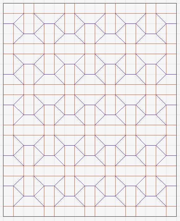
This is “Basket Weave”, designed by Eric Gjerde. Folded from a 750x500mm rectangle of Kraft paper, on a fine triangle grid over the last few days.

The geometry here is mesmerising – the entire field used only 2 twists, alternating: Open Hexagon twists that rotate counter-clockwise and Closed Triangle twists rotating clockwise. The alternating rotations absorb the intersection conflicts but the folding is so dense (ie. these twists overlap) making the collapse an exercise in patience and perseverance indeed.

I struggled to find a regular rhythm when collapsing this tessellation – each molecule caused deep and awkward pleat overlaps and I could not devise wraps that would make them any less awkward. Working simultaneously on multiple molecules seemed easier as I did not bury so many axial creases while getting it to fold flat. The margins continued to be tangled.
I decided to pre-crease the open hexagons because I could derive the spacing accurately, reasoning that the triangle twists were the glue that set the hexagons in place – this I think saved me making some major blunders in collapsing, although I did notice a few times where the triangles twisted in the wrong direction making surrounding areas clash.
I am looking for a weave that I can fold VERY small, perhaps to make a lampshade of similar decorative inlay. I am not sure this is it as I am not sure i could physically fold this one much smaller without a lot more MUSH. This sheet ended up having pleats about 1cm wide – pleat width determines the size of the weave. My fat clumsy fingers would have struggled to navigate and collapse a smaller grid with this crease pattern.
Continue reading


