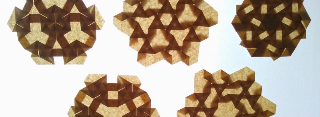
I virtually attended OWM4 (Origami World Marathon 4) recently – one of the classes I attended in the wee hours of the morning was a workshop run by Riccardo Foschi:
Riccardo has a recognisable style and his models are a delight to fold (you will find lots of them in this blog). This stylised human bust has such a serene expression on their face, I knew I wanted to try it.
My fold live in the workshop was ok, but re-visiting it when I had some more time (and better understood the fold) resulted in a nicer overall model.
I had recently purchased some “Shadow Thai” paper from Origami-shop.com and thought it would be a good fit for this model.
I chose a grey/smoke blue sheet (black on the reverse, it is a duo paper) and figured because it is a little thicker that it would help with the statuesque quality of the design.
When you talk of “box pleating”, the young kids in the origami design sphere seem to think they invented it. I was fishing around on the web, for origami-related things as you do, and stumbled across an astonishing scanned page from Neal Elias’ notebook from 1968 that features box pleating:
This is Neal’s “Boy on a motor scooter” – an amazing proto-design from 1968!!!!! (this is all there is, you have to fill in the gaps – it was his personal notebook, the diagrams were all HE needed to fold the model) but what an historical gem of a design. It is doubly interesting because it was designed 3 years before I began my journey in origami as a wide-eyed, clueless 11 year old.
Further research suggests this page was “ripped” from a BOS Publication Booklet 35 (still in print?) called “Neal Elias Miscellaneous Folds – II “, edited by Dave Venables. I have purchased the previous Neal Elias volume but was unaware this treasure exists – it has prototypes of some very famous and completely revolutionary designs indeed (like “The Last Waltz”).
Back in the “early” days of western origami, Elias was a pioneer, realising that by gridding a sheet of paper, then using gridlines and 45 degree connectors you could pleat astonishingly complex structures that could then be shaped into complex figurative models. As a kid, the few models I had access to from him were like crack to me. I mastered the “Elias stretch” (these days I think they call it a ‘pythagorean stretch’) and “Elias base”, making skiers and knights in armor, all from squares.
Many of his designs use odd shaped paper – this model uses an 8×22 grid, and the colour change base is particularly wonderful, leaving all the bits of a person in one colour and a lovely long pleat bundle of alternate colour emerging from him. I can see so much potential of all sorts of things here.
Things have been busy, lots happening in the real world so it is sometimes nice to get lost in a fold or two:
This lovely fully 3D skull, designed by Naito Yukata and wrangled from a 3:1 rectangle has been quite a journey.
The pre-creasing was fiddly but laid in landmarks that then aided the staged collapse. I found it easier to collapse parts of the model separately, then open the sheet back out to do the next section, laying in the final resting creases as I went – this meant that the “all at once collapse of the top part of the skull was easier.
The teeth introduced a lovely layered pleat structure I had not seen before and the overall shaping is a bit of an art I think.
Determined to fold something, I came across some diagrams in Origami Dan (an origami-focussed Discord) and figured I would give it a go:
The idea behind the the fold is interesting – making, from a square, a 3×4 matrix of “pixels” that can be colour changed either whole or in part. From this base you then strategically reveal colour to form letters of a typeface.
Designed by Jason Ku, it is a clever and flexible shape and I then set out to form all the letters of the alphabet and digits of basic numbers.
Some of the letters represented more challenge than others – some had little fiddly 1/4 triangle components, others had reverses contrary to the underlying structure, requiring some strategic swivels and reverses. the more observant among you will realise I stuffed up the colour conventions and got a few letters in reverse colours to the others (I, J and L for those that did not notice) – meh.
The most time-consuming part of this fold was compiling the photo record and stitching it together – happy I managed it however.
There are many models I just HAVE to have in my folio – David Brill’s “Double-Star Flexi-Cube” is one such model:
I first folded this back in my first 365 origami project (the original reason for this blog). At the end of the first 365 I held a charity auction and the original white DSFC provided a rather nice amount for my nominated charities.
I have only just got around to folding it again. This model requires A-series paper proportion, so I decided (insanely) to use A7 sheets, and chose 2 bold colours (red – yes that is RED, my phone camera seems singularly unable to photograph it, and purple) because I had 4 sheets of each. Each A4 sheet is cut into eighths – 64 sheets (32 for each cube)
deliciously, you fold 2 identical stars then, by the magic that is geometric topology and strategically placed “hinges” you can morph a star into it’s own negative (a cube with a star-shaped hole) then nest them inside each other.
I love this to bits, but must admit to having (again) to cheat on this model – the “locks” are not very positive, it tries to pull itself apart and there is little locking it together (bar some overlapping edges, simple flap tabs into pockets etc) – this is a bit of a pity. I used small strategically placed glue spots to stop it exploding every time I even looked at it suddenly.
Flexi-geometry is remarkably satisfying to play with, the geometry of this cluster is delicious.