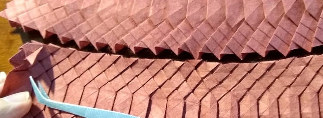
One of many things I like about being a subscriber of JOAS’ Tanteidan Magazine, is the little modulars that usually start each edition. Leafing through #191, I spotted a series of cubes designed by Jun Maekawa:
My pick of the cubes is his “Binding Cube”, a delicious little 6-piece modular whose layers lock so completely and tidily, the cube looks like it is one piece.
Folded from 3 squares of Tuttle duo each split into 2:1 rectangles. The module is relatively simply folded from thirds, the lock has layers of adjacent modules interleaving in such a clever way. Some of the modules were hard to place because the lock has very little clearance if folded accurately.
I like this model a lot, and am also happy with the colour choice.
Cleaning my desk is an important psychological activity, it helps me “move on” and, oddly, I had not cleaned my home desk since well before I retired … I am not sure why, but I just was not ready:
The cleaning process also de-clutters, re-homes and generates a pile of detritus headed for the rubbish bin. Among the accumulated layers of life I discovered a printed diagram from Pham Hoang Tuan for a lovely ornate goldfish.
I remember being sent a bunch of printed diagrams with a paper pack from him (I won it for … something I cannot remember), and realise I have yet to fold most of that hand-made and hand-coloured paper … must do something about it.
I approached this model like most – I first grabbed my goto test-fold paper (Kraft), decided to try a 30cm square and set of, reasoning that I will either finish it or fail trying – both are useful journeys.
Like many diagrams from Pham Hoang Tuan, I found some inconsistencies between what was being asked and what you had to do that with, but as a reasonably experienced folder I was able to “creatively” step over those weirdnesses.
This model is lovely, and screams for pretty, textured, thin paper – so I must re-visit it with the same. Like Ronald Koh’s Goldfish, this model is volumetric (it is chubby), has a profusion of fins and the shaping requires a deft, delicate touch. I love the formation of the eyes and separation of the fins, a symphony of bizarre genetic engineering designed to create fan-tailed delicate ornamental goldfish.
It contains a number of seemingly impossible closed-sinks to shape the body and create volume, but the net result is quite beautiful – one I will return to.
I have recently completed the mammoth 50hr+ live fold-along festival called The Origami World Marathon. I folded as many as I could physically attend, and it is a super rare privilege to be actually taught by such world class designers.
I managed about 14 models live, slept some and can complete those missed because, as part of the purchased ticket I gain access to video tutorials from the designers for the next year – win, win.
Nothing makes you feel old like stumbling across a delicious, simple new design from an 11 year old:
This is Bảo Long’s design, which appeared on one of the Fakebook groups I am a member of (https://www.facebook.com/groups/366246184054415). I am amazed this did not exist before as the separation of legs and abdomen/cephalothorax is so natural.
Folded from a 20cm square of Tuttle indigo duo paper, lovely sequence, terrific and pretty quick also.
EDIT: I just noticed it only has 6 legs (pretty sure I can find more), I guess 11yolds cannot count these days 😛
Browsing the current Tanteidan magazine, as you do (if you are a paid up member of JOAS), I saw a curious design for a “yummy” rounded unit, designed by Miyuki Kawamura, and decided to fold one:
The fold sequence is simple, the collapse creates a volumetric, rounded, colour-changed “eye-ball” like unit that holds itself together using paper tension. Like most unit designs, it has flaps and pockets, so I had to fold another 2 to see how they connect.
Again, by the miracle of paper tension 3 units unite into a lovely cube corner, so I had to fold another 3 units to make the smallest solid kusudama, again positively locked and, boy, the geometry is fascinating.
Nestled in among the eyeballs is a perfect cube. I may fold more of these (however I will fold using a smaller paper (I used 15cm square, but can easily fold smaller) as I think the 30 module is the pinnacle of weird but interesting kusudama.
Although (technically) a re-fold, the last time I attempted to fold this I had a partial crease pattern and a broken incomplete set of instructions in Russian, and just muddled along. I am not sure the resultant model even looked like Wall-E, but I was happy to sort of nut out a scheme for making his tracks.
I stumbled across a set of partial diagrams by “Tosummerny” in Chinese that seemed to surface more of the actual process, so decided I had to have another go.
I went big – 90cm square – seems excessive …but … I have another exhibition pending and thought this might make a good display piece if it ended up tidy enough.
The diagrams clarify the construction of the pleats necessary to form the main body, and how they cleanly articulate to make the beautifully treaded tracks, and also simplified what I had in my previous attempt mangled together to form the eyes.
It is a wonderful thing when designers share their processes, crease patterns and diagrams. Boice Wong is one that readily shares the CPs of his amazing designs, and when I saw “Sword and Shield V2”, I knew I had to give it a go:
Although I have been folding for decades, most of what i have folded has been from DIAGRAMS (step by step folding guides). By far the MAJORITY of origami out there does not exist as diagrams, but a larger proportion exist as CPs (crease patterns). I have been, over the last few years, working on my crease pattern solving skills.
This model is based on Boice’s 24 grid CP, and the collapse is relatively straight forward. Sometimes CPs give you crease orientations (red=mountain, blue=valley), sometimes not. The skill comes with deciding which creases to impose first as part of the collapse. Sometimes it does not matter, most it does, some you can derive based on “knock on effects” on one crease that causes the orientation of a sequence of subsequent creases. Sometimes it is pure witchcraft.
For the last few years, over what was the Christmas holiday school holidays, I have gone lap swimming at a 50m pool near(ish) me. I always intended to continue into the year, but work and lane availability (due to squad training) at the times I could go always got in my way:
Having recently retired, I have been able to continue right into winter (the pool is indoor, it is heated) at a time that suits me, and choose to do it as one of my activities on Wednesdays. It is part of a broader activity set that is hopefully keeping me fitter and a little less fatter.
I first saw this lovely, simple, perfect design on Joseph Wu’s Facebook feed. It is a rare privilege to have one of Joseph’s designs shared step by step, and knew it was something I HAD to fold. It perfectly captures that delicate balance between clawing through the water, and drowning. The model is taking a breath on the left-hand side. This is something I struggle to do due to neck vertebrae fusion (for some reason right-hand breathing is easier). Swimming is a gentle exercise that is gradually giving me back some of the movement lost since the neck re-build.
I folded the model from a piece of Tuttle indigo dye duo paper that has a pattern that closely resembles the ever-changing abstract water caustics I swim through every time I get in the pool. I love the simplicity but also the accurate depiction of that, a very human act of swimming.
This model has been on my “must fold” for ages, but I had only ever seen a CP and could never make head nor tail of the design. I saw a rendition on Origami Dan Discord and, after an enquiry it turns out there exists an unofficial diagram, drawn by Hua Ge that guides folders through this terrific insect:
I split a sheet from a new 60cm roll of medium weight Kraft and began folding. There is a load of pre-creasing, primarily setting up the high-density collapses to make the long thin legs, so accuracy early on pays dividends later.
Uncharacteristically, this model uses loos pleat structures to bulk out the body, define the wing covers and head/thorax/abdomen, with a deliciously complex un-sink to make the head-thorax join. Interestingly this model also has a super-detailed head/face – it reminds me so much of the hoppers in “A bugs life”, and it has real “cute” personality, as much as a locust can be cute.
Tucked away in an inconspicuous corner of the deserted clearing, nestled almost invisibly among the leaf litter, the first signs of civilization were found in the form of a rough-hewn but definitely hominid-worked paper offering. For whom, to what, why … we shall never know:
Followers of the blog will notice occasional references to paper making pursuits. This post looks at the most recent results of a paper making workshop I attended in early July 2023. I had previously (back in 2019) been a member of PAQ (Paper makers and Artists, Queensland) but found full time work made attending events difficult. Now I am retired I have more freedom, so reapplied for membership.
The group’s interests in paper are diverse – from botanical paper making, monoprinting, encaustics, stitching, collage, pulp sculpture and more – my interests are (fairly narrowly?) folding, but it is important to have ones interests informed by a wider palette so I am very much the learner in that group.
Previous workshops I made sheets with finely beaten banana stem and cotton display board, day lily and lemongrass pulp, and still have some of the paper from that session. This session we pulped banana stem (coarsely this time) and mixed it with lemon grass, Philodendron, and South African Pigeon Grass stem, in various combinations. The pulp was added to water, then a suspension-aid made from water soaked chopped okra, which generates a mucilage that makes the vat water more goopy, helping the pulp to stay in suspension longer before settling out. The results were much coarser paper, but it presented an interesting challenge to see what I could fold from it.
I first pressed then dried my sheets, brought home still dripping. I carefully separated them from their couching sheets (old torn up bed linen) and selected sheets to process further. Using a fairly stiff batch of Methyl Cellulose, I stuck sheets to my glass and let them dry, reasoning (correctly it turns out) that the MC would make the sheets more pliable and bind the fibres more closely together (given some of them were very loosely bound, this seemed like a good plan).
I was asked to test fold a model from Peter Buchan-Symons’ new book in progress “Folding Fantasy 2”:
This is a colour change lizard – there seems to be a resurgence in interest in precise figurative 2-d depictions of complex shapes via colour-change at the moment. This model cleverly exposes parts of one side of the paper, hides others with the reverse side and designing such things is a real skill.
The instructions for this model are clear, paced well and really approachable. Knowing Peter’s work, the book will contain a real range of complexities (certainly FF1 was a wild ride of simple through to very tricky models – a good one for your bookshelf).
I look forward to more opportunities to test out his designs, he does things differently to other designers, and variety is a good thing when looking for an approach to solve particular design problems.
Folded from a 21cm square of Indigo print Tuttle bi-colour paper, you could go smaller but would need to be careful not to lose the thin zig-zags that are the front legs and tongue.
I have the privilege of being asked, from time to time, to test fold origamists new models. Steven Casey (designer of the BEST origami echidna there is) asked me to test his new design for a clownfish, naturally I jumped at the chance:
I took a 6″ square of regular origami paper (orange on one side, white on the other) and, armed with disbelief that this was the suggested paper size, began folding.
My fold approach over the years has changed markedly – I fold until either (1) I get to the end or (2) it fails, and I learn something. I FULLY expected this to go wrong – my fat clumsy fingers do not normally fold those small squares of origami paper people keep giving me (with every good intention), and for LOTS of this model I resorted to my favourite set of bent-nose tweezers just to keep it sharp (and not mush with said fat clumsy fingers).
It became pretty apparent early on that the fold sequence was entirely achievable with 6″ (15cm) squares, resulting in a charming little totally recognizable nemo. I made a few cosmetic suggestions to the diagram set (sometimes the designer lets me edit their diagram directly) and repeated the fold on 17cm square – I liked the smaller one better but it was prolly because I rushed the second fold while paying attention to the telly instead. I would like the head/gills to lock on to the body a little more and the fins also to stay together, but these are minor unimportant quibbles.
I am hoping Steven is planning a book of his new designs, this one is lovely and reminds us all that “you just gotta keep swimming”.
To mark the release of Phạm Hoàng Tuấn’s new book, he released a photo sequence of a little songbird on Fakebook:
Hundreds of development photos lead you (sort of) through the exacting process of folding this little wren-like bird. I decided to throw some nice paper at it.
The suggested size the author used was 20cm, so I went 35cm square, thinking I would have been safe, but should have looked ahead as it got waaaay too thick due to layers really quickly. Not to be deterred, I thought I would try to shepherd the now clearly wrong paper through a torturous fold,
In the end, some features (like the head) were really clumsily folded due to thickness, but I am pretty happy with the number of bird-like features I was able to tease out of this lovely sheet. I was also reminded of an important lesson – choice of appropriate paper is REALLY important on complex-supercomplex models.
I posed and stabilised it as much as possible, and will prolly fold it again some other time. The photo sequence was super annoying to use – it kept timing out (google drives get lazy) and so many of the photos showed indeterminate actions at times I was left scratching my head thinking “what is actually being shown here”. Beggars cannot be choosers however, so I gave it a red hot crack.
I love a clever conceptual fold, and “Emptyhead” designed by Boice Wong (origamibyboice) is a clever example of art designed to make you think:
The first of these models – “Emptyhead I” is a lovely character that has an empty box sitting on his shoulders for a head. This model, uses a variation of the original CP (crease pattern), and represents his dumber brother completely detaching his head from his shoulders.
The original, as folded by Boice, has a solid cube for a head, but I Macgyvered a scheme to make it an open 2x2x2 cube instead, so he is clearly related to his more sensible brother.
From a 32 grid, this model cleverly presents shoes, cuffed pants, dress shirt, tie, collar, overcoat with lapels, 1 regular arm and one extra long arm, part of which becomes the box head. Such a neat design, the paper cleans itself up and provides wraps to make the seams tidy on the arms also. All this with no cuts, folds only. I did resort to using a few white glue spots to keep seams and layers in place, but tried to keep it as au-naturel as it was possible while being able to pose him for archival purposes.
I must admit to obsessing about this version, having solved the CP for the first version fairly quickly (which really surprised me if I am honest). I just assumed this version would let me make the free box head, but as I discovered, turning the long pleated tube into an open-ended box, when there was so little paper was a major issue.