
Now it is a pubic holiday here in Brisbane for the RNA, and rather than do something show-related, I thought I wold “treat” myself to a Satoshi Kamiya model:
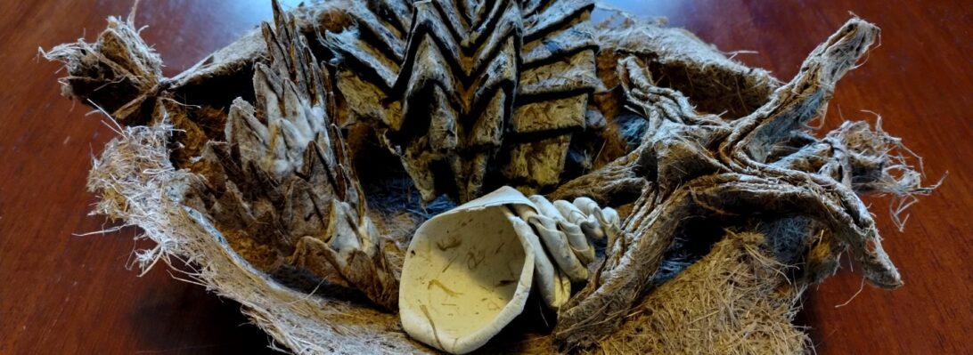
Mistake # 1 – ignoring the suggested paper size – I Folded this from an 18cm square, suggested minimum was 35cm – lol. It became increasingly obvious as I got further and further into this torturous fold that scale was an issue, but I soldiered on with my fat and clumsy fingers.
Budding Scientists: What is wrong with the picture above? )Answer follows*.
So much paper torture but the result, from the outside is actually fairly simple in appearance. I like the body proportions, and the modelability of the eyes and head (difficult to see at this scale). It is a pity this model is not free standing (I had to use a blob of blutac and a bent paper clip as support).
This fold was great for a bunch of reasons, including the exacting nature of the pre-creasing (half millimeters count … mistake #2), a stonkingly difficult sink half way in which baffled me for nearly an hour as I unfolded, refolded and wondered how the layers would ever sort themselves out.
I am happy with this as a first fold, and will fold this model again with a larger format paper. I did not use copy paper but figured with 120 steps, tissue foil was probably the way to go as some of the primary creases get major fatigue.
*Worked out what was wrong with the second picture? It is a WELL recognised fact that TRexes NEVER ate paper, silly.


