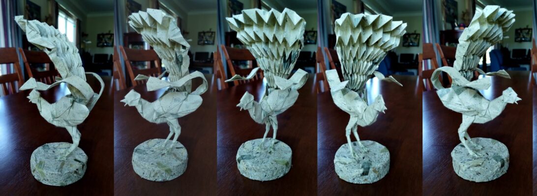
One of the few applications of the Miura-Ori (map fold) that I can tolerate folding is to make the fantail of Satoshi Kamiya’s Lyrebird.
I had a half-sheet of leaflitter paper in my stash (bought some 8 years ago) and thought it fitting to fold a bird that lives in the leaflitter out of it.
This is not my first fold of this beautiful model, but it is my best. Having good, thin, tough paper helps as accuracy is everything when folding the base – so many opportunities for crease misalignment exist and, as the paper thickness ramps up, there is bulk there.
Interestingly, the “bulk” ends up being in the body area which then naturally “fattens up” the bird in a really naturalistic way.
Browsing a Korean Origami Convention book (the 6th – 2015), as you do, I stumbled across a Platypus I had not seen before:
Designed by Fernando Gilgado, this genius design uses duo paper to isolate the beak, tail and legs from the body in a really interesting way.
After some simple pre-creasing, you collapse to a base that looks really useful for all sorts of long critters with head/tail and 2 pairs of legs (like a crocodile, say)
There were many standouts from the epic Origami World Marathon (OWM5), the rabbit taught by Riccardo Foschi was one such:
So much character teased from a 16×16 grid, this delicious comic rabbit stands on its own and is dry-shaped, without the need for any glue or MC.
My first fold used Tant paper, and was smaller but useful to explore the structure. In this model’s case, a thicker more robust paper actually helped with the shaping – I managed a lovely plump belly and rounded face, arms and legs with toes/fingers implied by subtle divots.
As a closet botanist, I am interested in floral geometry – many flowers are based on pentagons:
This is “Star Katrina”, a beautiful kusudama designed by Xander Perrott. Folded from 30 x 2:root 3 rectangles cleaved from squares of Tuttle Indigo dye duo paper over the last couple of days.
The unit is based on a tight triangle grid – fairly easy to fold accurately and the locking mechanism is so positive that this kusudama is held together via paper tension and friction only (no glue, truly, none).
As far as I can tell, NFTs (Non-Fungible Tokens) are dumb:
On this blog, NFTs stand for “Newly Folded Things”, but in the imaginary world of cryptocurrency and blockchain, NFTs were going to be the next big thing.
…until they were linked to money laundering, and people buying them realised that all they were actually buying was an entry in some blockchain register, not the “like, really cool, next level bored ape…man” [I assume that is how “the kids” now speak]
This NFT Bored ape was designed by Viswa Sarathi, and I stumbled across the design leafing through an edition of “Origamiaze – The Indian Origami Magazine Issue 02 December 2022” (yes, I was amazed there was one also)
Folded using duo Ikea Kraft paper, it was a fun (if wildly inaccurately diagrammed) fold – on re-fold I think I would refine the expression to make the ape even more bored.
Wrapping up an editing spot on a forthcoming new book, I decided to fold Tu Kaiming’s design for a Flying Western Dragon:
It is rare to see a dragon posed mid-flight, and I like the approach taken here.
Oddly, it is usually westerners that think dragons need wings to fly – but they bring a dynamism that it is difficult to achieve without them. I also like the styling (ribs and other details) – the ribs remind me of the Xenomorph I just finished also – a nice detail. The head is simple, horns suggested – a nice balance of form and function.
Using a 50cm square of rust-coloured Satogami (my first sheet from a paper pack I got from Origami-shop.com) the base creases are easy but the model escalates pretty quickly to become a tight bundle. The Satogami took the contortions and flex tension pretty well (even during a dense “turn this part inside out as a complex reverse-fold sink). Satogami is a heavy paper with an interesting subtle texture – I must use it some more.
It is clear that Origami is currently experiencing a Renaissance – so many new designs emerging from everywhere, it is also wonderful that we are getting to see new designs from all over the world.
I have long been drawn to the particular thrill of Science-Fiction based horror – few franchises do it like Alien:
This Xenomorph, designed by Kade Chan (you too can have a go at folding it here) was folded from a 60cm square of Crumpled VOG paper – a rare find in my stash, near last remnant of a purchase some 10 years ago when you could still buy VOG paper.
My previous fold of this model was in crispy Kraft in 2013, and I had always meant to return to it and fold a presentation fold. With the release of “Alien Romulus” in cinemas, I figured the chest burster was about ready to pop.
I first folded these little critters, designed by Robert J Lang, using a square cut from an A3 printer paper sheet back in 2011 as part of my original 365 project:
Remarkably, even with that terrible paper, all the features of the critter were present however not very refined.
Australians call these “Slaters”, but they also go under the name “wood lice” because these little isopods are found in decaying vegetation – which is why I decided they should be folded from Mango Leaf paper. It makes this fold a bit “meta” in that the critter is folded from mulberry paper that contains leaf litter.
The fold sequence is exacting, forming trapezoidal molecules for each of the 14 legs, along with antennae and a rather beautiful segmented shell. This model appears in a few of Robert’s books, I folded this one from “Origami Insects 2” – a rather splendid volume from Origami House in Japan. bought from Origami-shop (even though, strictly speaking, it is not an INSECT….).
I decided to fold two so we could see one open and one curling up into a little armoured ball – they do this when in danger.
Our current car is old, but a lovely tiny Mitsubishi Colt (that looks a LOT like this model), and … eventually … we will need to replace it but, annoyingly Mitsubishi only make HUGE battleships now – not everyone wants a battleship!!!
The life of a male praying mantis is not all beer and skittles – inattentive and less nimble males often become a post coital snack for their partners in a brutal twist on “the circle of life”:
This is a pair of Satoshi Kamiya’s Praying Mantis, and this may well be my longest fold (in total elapsed time) to date. Two and a half years ago (the year before I had retired), I sat down with a crispy 55cm square of Kraft paper and began folding the maquette for this model (the brown one). I was stressed, it ate up an afternoon and calmed my racing brain but I got tired, lost my place and then mental fog set in and I could not for the life of me work out how to do the next step (making the little barbs on the inside of the front legs).
Determined to return to it the next day, I tucked the model into the open book I had in my book stand, put it away and … ignored it for 2.5 years. I am not sure my book “Works of Satoshi Kamiya 3” appreciated being splayed open for all that time and is now, finally, resting closed with the rest of my Origami library.
I finally had the “perfect” mantis paper – pre-coated green Unryushi tissue from Kami paper store, purchased a month or so ago when we were in Melbourne. I cut a perfect 50cm square from this deliciously thin and crisp paper and began folding. I was fired up to return to the partially finished but stalled fold and give it another go – how hard could that be?
I folded the green up to where I had stopped with the brown, then realised the next step was actually pretty simple (just not clearly diagrammed – representing such complex 3d manipulation in a series of line drawings is really hard, I know), so was able to take both the maquette and green production fold all the way to the end of an astonishing 271 step sequence.
The design is genius, and relatively efficient – interestingly there are triangle sections of paper folded away into the middle legs that is the only “waste”. Via a torturous process of isolating, crenellating and thinning the entire morphology of a lethal stick insect emerges from the tangle.
As an apex predator, the praying mantis is the perfect killing machine. Large swiveling eyes, sensitive antennae on a fully articulated head, complete with chomping mouth parts. Perfectly proportioned and armored thorax sporting 2 sets of thin legs and a pair of lethal clamp-like razor fists. Wings and a lovely plump pleated abdomen finish the features of this astonishingly complete insect – all from an UNCUT square of paper – just wow.
I am often given 6″ origami paper by well-intentioned friends who know I do origami and assume 6″ paper is useful to me. I have lots of it – and I mostly use it to fold kusudama:
I had a pile of duo Tuttle watermelon/lime duo paper, so resolved to treat it to make it more interesting. I bought some acrylic inks a while back, and a mouth airbrush, so decided to tone the pages while learning how the airbrush works – a fun experiment.
I chose to spatter the watermelon side with white ink, and the lime side got yellow and black spatters. The effect is quite lovely and delicate – it compliments the geometry of the model really well.
I had seen a youtube tutorial of Kovács Vincéné’s “Nova” kusudama, and I thought the geometry really interesting. Like many spikey balls, 30 units in 5/3 clusters makes a nice little structure.
One of many goals, long term, is for me to make and fold my own paper. By “make paper” I mean collect, process and form sheets from pulp. I clarify because one school of thought around “making paper” is laminating or treating existing sheets – I do that also, but yeah, there is a distinction.
I attended a workshop out back of Gympie with Dion Chandler, using my newly acquired mold and deckle, and pulled (get the lingo 😛 ) A3 sheets – by the end I got pretty consistent at it but need more practice.
I ended up making A3, A4 and a smaller “letter” size”, love the deckle edges and the structure of the sheets. I have also Methyl Cellulosed some and, so long as I apply the MC to the paper (and not the glass I am sticking it to) then the sheets come away crisp and sturdily hold folds crisply as well.
That workshop we were pulling from a vat that started mostly with cotton pulp, and gradually had recycled kozo (mulberry) to it – quite a resilient mix. the resultant sheets are precious and wonderful.
It is a well known fact that Australians MADE up the illogical collection of animal parts we then called a Platypus:
Ducks bill, fur, poisonous spines, webbed feet, lays eggs, feeds young milk, lives under water … LOL … then only people silly enough to believe this are tourists, right?
One of many benefits of networking at an origami conference is that you get to mix in the real world with talented designers – if you are lucky they share their designs with you.
One of the many advantages of being on the editing team for an origami book is that you get to see models before they make it into the wild. This Toucan, designed by Jiahui Li (Syn) appeared in the book “Comic Origami 2 – Feathered Friends” among a plethora of other fun folds:
I had a much used 40cm square of Origami-Shop Shadow Thai paper that I used and re-used (after ironing flat) to do test folds. I quartered it to make 4 20cm squares and set about finding folds for it.