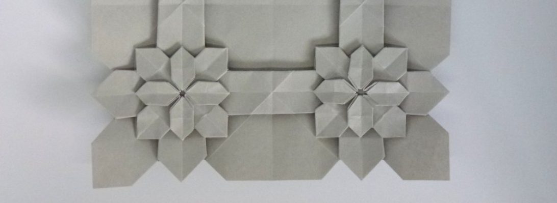
Determined to fold something, I came across some diagrams in Origami Dan (an origami-focussed Discord) and figured I would give it a go:

The idea behind the the fold is interesting – making, from a square, a 3×4 matrix of “pixels” that can be colour changed either whole or in part. From this base you then strategically reveal colour to form letters of a typeface.
Designed by Jason Ku, it is a clever and flexible shape and I then set out to form all the letters of the alphabet and digits of basic numbers.

Some of the letters represented more challenge than others – some had little fiddly 1/4 triangle components, others had reverses contrary to the underlying structure, requiring some strategic swivels and reverses. the more observant among you will realise I stuffed up the colour conventions and got a few letters in reverse colours to the others (I, J and L for those that did not notice) – meh.
The most time-consuming part of this fold was compiling the photo record and stitching it together – happy I managed it however.

