1127: Bin Chicken

The majestic “Bin Chicken” is, sadly, an aussie icon – those black-headed ibis emerge from the deepest, moistest corners of a ripe dumpster, dripping bin juice.

Yes, I KNOW that an Egret is not an IBIS (the beak is different and the body colouration is different… but… creative license). This is Jeong Jae Il’s “Egret” – a beautifully lifelike rendition of an altogether more polite bird. The diagrams, from “Potential Origami” suggest heavier paper, so I trotted out a lovely 58cm square of duo Yukogami to work this model.

The paper is stark white one side, jet black the other, heavily textured and light cardboard in thicknicty, but I thought I would fold until either it was finished or it failed. The only real struggle was thinning down the legs that end up being about 12-18 layers. In finishing, after dry-shaping, I slid a little white glue inbetween the layers then re-formed on my dry shaped form, compressed and found the paper dried solid – an added bonus was I did not need to add wire, she stood on her own!!

Continue reading

1126: Matt LaBoone’s “Chinese Dragon”

Matt shared a 2015 design on Fakebook recently, so I decided that given it is nearly Chinese New YEar, and it is a “Year of the Dragon”, folding a dragon I had not yet attempted was a good idea:

This dragon, in structure, is similar to Kamiya’s Ryujin 1.2 (in sheet layout at least), but does some interesting things with the body and tail that were fun to fold.

Initially I tried it with a sheet of Yukogami, and abandoned it before I managed to get to the base because it was just too thick. I resorted to a nice crispy thin 55cm square of Kraft (I should have test folded it first anyways – doh!).

I added a wire armature and did a swirly pose, raised a front foot and had the opposite foot mid-step, it is a little cute.

Chinese dragons differ from the Western tradition by not needing wings to fly – they are way more “serpentine” as opposed to scaley bird or scary bat.

1125: Botticelli’s “Birth of Venus”

After acquiring a copy of “Potential Origami” by top Korean Origami designers, I was struck with a choice – which astonishing model should I try first:

It is well known that i love a bit of classical art, and am fond of a fullsome bosom, so decided on Han Ji Woo’s astonishing design based on Boticelli’s painting masterpiece.

I started with a 90cm square of kraft, and intended to give this a try, fully expecting it to fail. My approach to designs outside my skill range is to “fold until it fails or is finished”. I have used this mantra for decades and, as was the case this time around, I discover I have “levelled up” in terms of skills.

The design here is genius. Although it is a boxpleated model, the allocation of flaps to details and proportion evident, as well as attention to the original artwork is outstanding.

From a single sheet of paper, we have a naked lady, masking her modesty with hands and a wicked hairdo. She is standing on an open scallop shell, because … well … that is how she as a Roman Goddess was apparently born. Clearly a little more is now known about where babies come from but it is a striking model version of Botticelli’s classic painting.

I want to tell you this model came easily, and that the shaping was intuitive, but … it wasn’t. I suck at shaping, so really feel like i have levelled up on this model – making the body luscious (yes, I know the breasts are a little “cubist”, but ample and pointed in the right direction. I am particularly happy with the much layered and frizzed hair.

Continue reading

1123: Anubis

I have always been fascinated by Egyptian symbology, myths and ancient artforms. The very pictorial style is angular, stylised, often animal-based and very interesting. Anubis is the god of funerary rites, protector of graves, and guide to the underworld, in ancient Egyptian religion, usually depicted as a canine or a man with a canine head:

I am currently watching STARGATE, a few episodes at a time with my son. I began watching it back in the days of free-to-air broadcasting but, for whatever reason I stopped (prolly because I had a life and no longer had time/access to episodes). The series premise is interesting, and I particularly love their hijacking of Egyptian gods/mythos as the “baddies”, as well as the whole aesthetic.

I wish I could remember where I first found this Crease pattern (CP). It has been in my “must try this, sometime” pile for a couple of years and I finally got around to it when looking for something to fold with my second bit of treated Wenzhou rice paper (not made of rice, is a fine and resilient mulberry). I also wish I knew the designer – can anyone help me out here as I would love to give proper attribution?

The CP seemed pretty straight forward – indeed the collapse was quite natural (I did not do my usual “parachuting” as I tried to collapse key details in the order that seemed most logical), and resulted in a base with a myriad of stickey-outey parts in more or less correct locations. I am so pleased with my developing CP solving skills – a loooooong way to go, but every success encourages me further.

Continue reading

1122: Pearl Anniversary

30 years ago, the Papermakers & Artists of Queensland (POQ) first formed – in July it was their PEARL anniversary.

As a diverse collective of artists (that allowed me to become a member) we were asked to respond to the notion of “Pearl” to assemble an exhibit of artworks to mark this occasion.

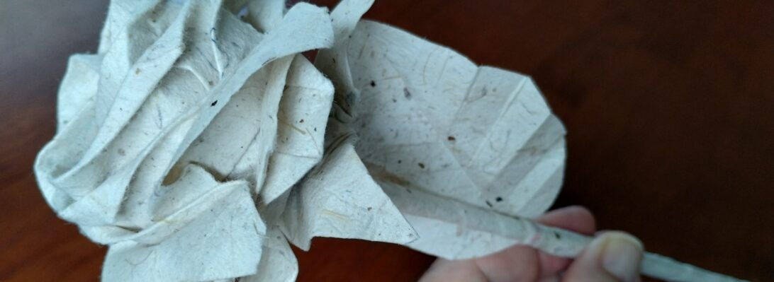
My thoughts, naturally, turned to folding and I was reminded of an organic 3D form I last explored for “The Offering” inspired by the work by legend Paul Jackson.

The idea was simple – using one set of slightly overlapping pleats in one direction, that are then corrugated in the perpendicular direction, you can “tease” dimensionality by “cheating” the overlap with a delicate pull.

Taking a square of trusty Kraft paper, I mocked up a Maquette, pleating and corrugating around a central line, then “MacGyvered” a hinge using simple box-pleating techniques, as I had the notion it should be a “book” of sorts. The hinge mechanism had a natural gutter that allowed me to bind pages securely inside also.

For the production fold, I chose metallicized pearlescent “Terryfoil”, I cut 2x 25cm squares and pleated and corrugated, carefully, then spread the pleats until it achieved the desired curvaceousness.

Continue reading